Following part1, this is part2 of a little series. Part3 can be found below.
In part1, we had a look at the spectra of various illumination sources and object surfaces. What our eyes or - alternatively - lenses of a digital cameras see is the combination spectrum of light source and object surface. That is, for every wavelength independently, the product of the light intensity is multiplied by the percentage of reflection of the specific object’s surface.
It is this combination spectrum what creates color perception in humans and digital cameras. The former will be the subject of this part, the later will be discussed in part3.
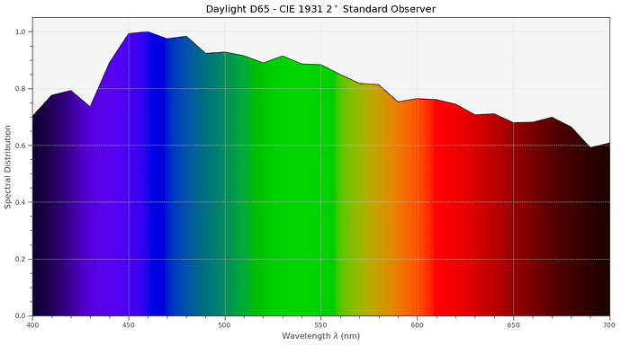
Let’s recap shortly. The standard illumination, used for example for proofing in the print industry, is D65 - an illumination very close to a sunny day outside, with a few scattered clouds. This spectrum looks like this:
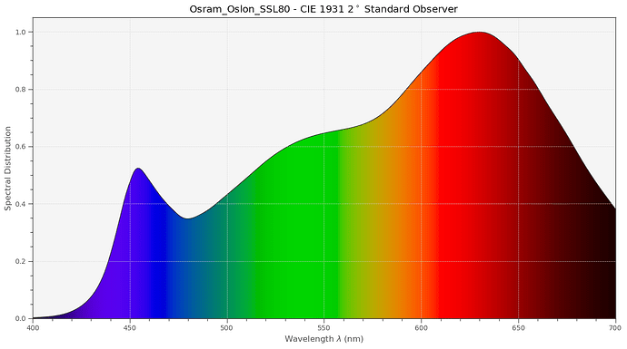
This illumination features a color temperature of 6500 K. The spectrum of a whitelight LED will look quite different, especially if the color temperature is different (in this case it is 3200 K):
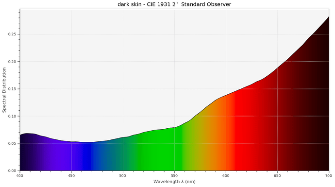
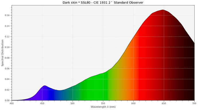
Now, the other kind of spectrum we are concerned with are the spectra of object surfaces. Take for example dark skin:
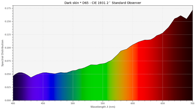
To arrive at the spectrum which our eyes see (or the lens of a camera), we have to multiply the illumination spectrum present with the surface spectrum. Again, every wavelength is to be handled here independently. With D65, we get that combined spectrum for our dark skin example.
With the Osram SSL80 LED, we get instead this combined spectrum:
Surprisingly, both spectra look quite different.
But, a “dark skin” patch included in an arbitrary scene would practically perceived in identical colors - irrespective of the illumination (D65/SSL80) chosen. How can this be? Well, we have to take another property of human color vision into account, namely chromatic adaption. This is the ability of the human visual system to discount the “color” of the illumination and arrive (most of the time) at the pure color of an object.
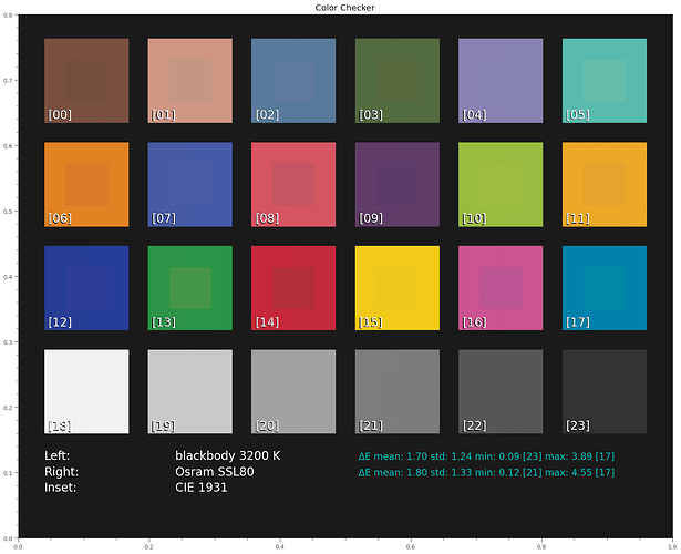
In a sense, chromatic adaption is similar to the auto-whitebalance algorithms in a digital camera - only much more efficient. Throwing into the pipeline a chromatic adaption transform (“CAT” - I am using the linear Bradford method), we get the following color perception under varying illuminations:
Again, the inset “CIE 1931” shows the color appearance under D65 illumination and serves as our reference. The left side of each patch shows the colors under a blackbody radiator at 3200 K, which would be very equivalent to a consumer projector lamp in the old days. On the right side of each patch, the results with an illumination with the Osram SSL80 white-light LED are shown. There are differences, but they are quite tiny and only visible because we can directly compare in the above diagram. If viewed separately, say in different room setups, no one would notice a difference.
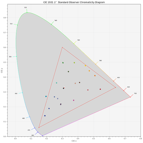
(A tiny sideremark: these color graphs are computed and displayed in sRGB-space, because this is the internet’s default color space. One of the patches, [17] “cyan” is actually outside of the color gamut of sRGB, as the following diagram shows:
The red triangle marks the border of sRGB’s color gamut. So the rendering of the cyan patch is somewhat lacking in all of these displays.)
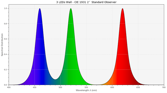
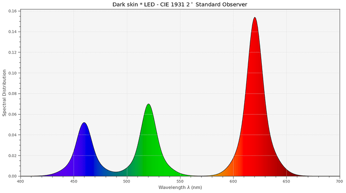
Returning to our main discussion: Let’s now throw into the simulation another, quite different light source: an LED-lamp based on the combination of three narrowband LEDs. Something like this here,
for example. If we play our “what spectrum arrives at the eye’s lens?” game again, we now get the following combined spectrum with the LED source:
Note that the shape and place of the LED peaks did not change; basically only the height of the peaks got adjusted by the interaction with the object surface.
Let’s see how this LED-illumination source performs in comparison to our other light sources over our full set of color patches:
Obviously not so great…
(The largest deviation with the LED illumination occurs in the orange region (patch [11]) because there is simply not enough energy in this spectral range, due to the gap between the green and red LED-bands.)
Quite generally, narrowband or spiky illumination is inferior to other illumination types for human color perception. This is the reason why sometimes clothing which color-matched in the store looks weird once outside. Or why the meat always looks better at the butcher shop than at home…
This ends our little exploration into how human color vision is working. In part3, we will look at digital cameras and how they see the world. And we will discover that we do have additional tricks in our sleeve which will allow us to improve a little bit the situation with respect to LED illumination.
