Color Magic

Following a suggestion from Pablo (@PM490), I want to start here a thread about color. For this, I have to resurect quite a few old JupyterLab notebooks. I’ll try not to say too much nonsense, but bear with me if I’m wrong.

In this initial post, I will talk a little about illumination sources. Part2 will talk about human color perception, part3 will discuss the response of digital cameras and how to optimize these.

I use for the diagrams extensively the Python Colour package - which is both intimidating and powerful, plus my own software ramblings.

Anyway. Human color perception is a complicated and not yet fully understood process. It is based on “light”, which is simply electromagnetic radiation in a certain, very small band. Specifically, human color vision is more or less limited to the range spanning 380 to 700 nanometers.

Within that small section of the electromagnetic spectrum, object surfaces have a characteristic foot print which in the end leads to the perception of a certain color by humans. As a side note: most other animal’s vision work in the same or a similar range of the spectrum, but feature occationally more different photoreceptors than humans: we have only three different ones available. And that will play a role later in this text.

Now, every single surface of an object reacts differently to the incoming light. Technically, this is described by a spectrum - which gives for every wavelength the amount of incoming light reflected back to the observer. The variance in these spectra creates the perception of different colors.

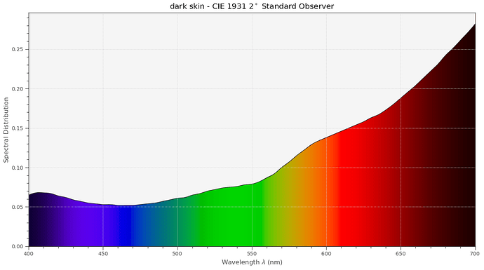
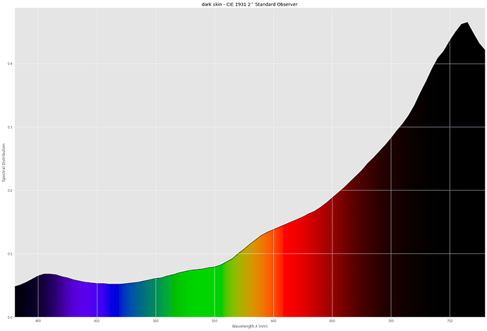
For example, this is how much dark skin is attentuating incoming light:

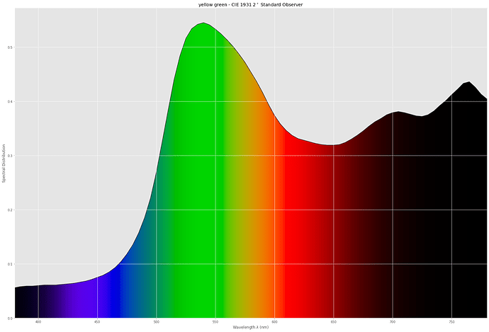
and this here is a spectrum of the green leave with a yellow tint:

How do we get from such a spectrum to the color perception a human observer would have? Well, for this, we need to talk a little bit about physics for a moment. The first thing to consider: light sources.

Light sources are radiation sources emitting light in some range of the electromagnetic spectrum.

Nature evolved all seeing beings in such a way that they are responsive to this little spectrum band. The reason is simple: that’s were sufficient light intensity is available by the sun and scattered light.

Not only do surfaces have spectra, but lightsources as well. Bright daylight is different from afternoon daylight or the light of a candle.

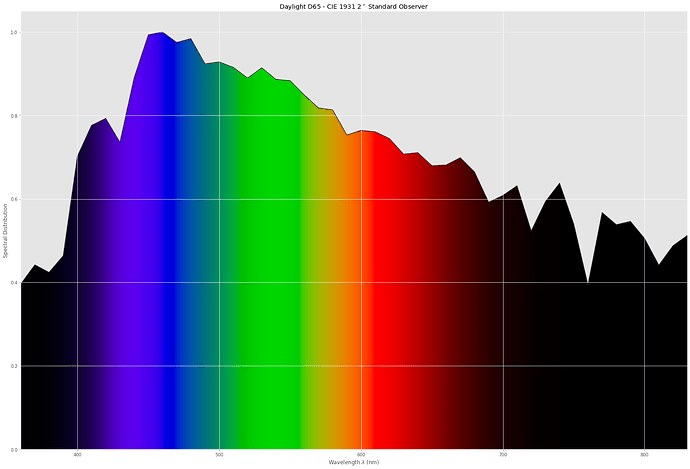
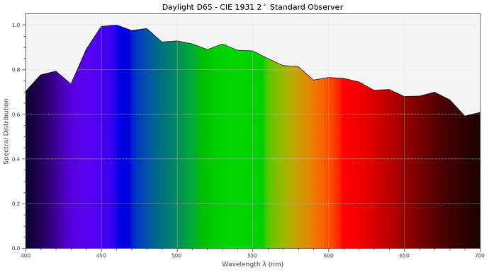
In fact, there is standard illumination defined which corresponds to “sunny, clouded day” - it is called illuminant D65 and is traditionally used when checking the colors in the print industry, for example. It looks spectral-wise like this:

So in a normal daylight scene, the light which actually reaches the eye of our human observer is the product of the light source’s intensity multiplied by the amount of light reflected by the surface of the object we are looking at - at every single frequency of the spectrum.

So, we end up yet with another spectrum, the combination of the illumination and the surface spectrum. This spectrum is projected onto the retina of our virtual human observer. Here, there are three basic receptor types, with filter responses (yet another spectral function) somewhat similar to the Bayer-filter in our cameras.

(These filter responses are rather broad. And that has to something to do with efficient data compression. The goal of the evolution was to be as sensitive to important variations in the spectrum of a fruit, for example, as possible, with the least amount of necessary hardware. One way to achieve this technically is principle component analysis (PCA). Basically, that is a transformation from, say, a complicated function to a less complicated one. The less complicated one is composed of functions becoming more and more complicated. In our case, the simplest approximation would be the constant average signal strength, the next complicated function would have a single bump (instead of being constant like the first one), followed by a function featuring two bumps and so on. Both representations of of a spectra are equivalent. But if you are not interested in details, you can stop the PCA after the first few components. That’s what evolution has done: in our case, we have three types of photoreceptors, some other animals have less, some other animals more.)

Already at the level of the retina, an amazing amount of computations are performed. There’s a huge image compression happening. Our optical nerve which connects the retina with V1, the first computational vision component in the back of our brains, features only 800 000 to 2 000 000 nerves - all things we perceive visually has to flow through this modest amount of signal cables (the screen I am typing this on has 2 304 000 pixels). And these nerves do not feature HDMI-type transmission speeds…

For our purposes, we do not need to get into all this detail. In 1931, a reference human observer was borne - that is the standard reference mostly used in color science. Every color perceivable by human beings can be characterised by only three color values (XYZ), or, if the brightness does not matter, by only two variable (xy). To arrive for example at the Y-value of a specific surface color, all one has to do is to fold the combined “light source”-“surface” spectrum with an appropriate filter response. Apart from a little further detail: the chromatic adaption capability of the human visual system. In photographic terms, this is similar to setting the appropriate white balance for a scene. This processing step assures that the pages of a book look kind of white in daylight, but also when reading this book under candle light. Within the context of the simulations here, I am using as chromatic adaption transform (CAT) the “linear Bradford” transform. There exist a lot of others - from “von Kries” to “CAT16” - does not matter too much for our purposes. In the end, simulating how a human observer would see a scene boils down to a bunch of spectral filter operations, with the last one condensing down the many values of the spectrum to only three color values, plus a chromatic adaption step.

Coming back to illumination spectra, an important class of spectra is connected to the radiation a black body of a certain temperature emits. Take for example the sun in empty space. Or a Tungsten lamp. Or a candle. The spectrum of these light emitters are all very close to a black body radiator.

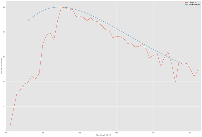
We can compare the radiation of a blackbody at 6500 K to the D65 spectrum:

Quite similar (the 6500 K is where the 65 of the D65 came from), but sligthy different.

Let’s see how a human observer would perceive a standard color checker illuminated by either D65 or the 6500 K blackbody radiator. For this simulation, the above sketched signal path (folding of illumination and surface spectra, filtering down to YXZ-values followed by a CAT)

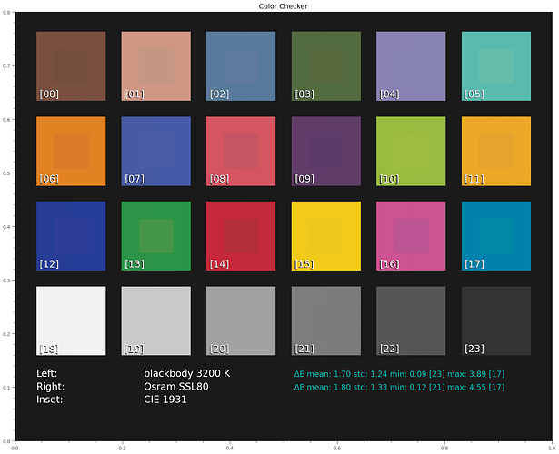
Just a short explanation of this kind of display. Shown is the arrangement of the color checker’s patches. In the central part of each patch (“Inset”) the reference color is displayed how it should look ideally to a human observer. The remaining ring of each patch shows other data. In this case, the left half of each patch shows the result under D65 illumination, the right side what came out with the blackbody 6500 K illumination.

Besides the visual display, on the bottom there are some numerical values. Basically, for each rendering of the color checker, the color difference ΔE with the reference (the center CIE 1931 pathc) is computed. Generally, ΔE’s less than one are imperceptible, ΔE’s above one might be noticed by a human observer. The mean ΔE and the patches with the minimal and maximal deviation are listed for each test. The patch numbers are also displayed in the lower left corner of each patch.

Now, we see that there is no difference between D65 and CIE 1931 at all. That is because the reference illumination of the CIE 1931 is D65.

However, there is a tiny difference in color perception between the blackbody 6500K illumination and the standard observer.

Let’scheck the CRI of these illuminations:

D65:              99.999
blackbody 6500 K: 97.995

Indeed, our blackbody illumination features a slightly less CRI than the reference illumination (which should not really come as a surprise), but it is still rather high.

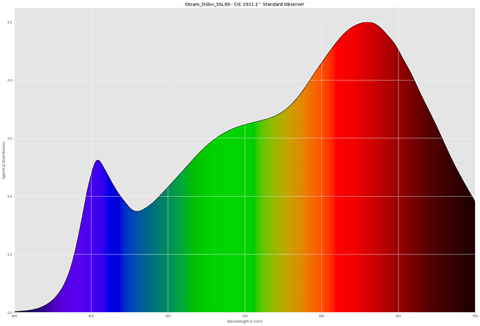
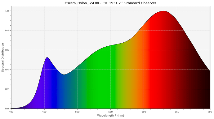
Now we are going to compare this to a whitelight LED (specifically, an Osram Oslon SSL80) which features the following spectrum, according to the data sheet:

And the CRI reported is at 97.286. Great!

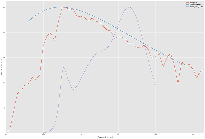
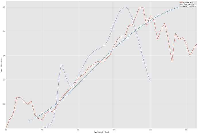
But… let’s compare the Oslon spectra with the two other illumination spectras:

The LED spectrum does not look at all similar to our previous illuminations. How come it has such an high CRI?

Remember that we talked above about the chromatic adaptation (CAT) occurring in human color vision? That a book viewed in bright sunlight more or less looks the same when viewed by candle light? We included in our blackbody radiation already the idea of a temperature, in this case 6500 K. And that number, called correlated color temperature (cct) is an important characterisation for illumination purposes. So let’s calculate the ccts of our spectra:

 D65:             6500.4
 Blackbody 6500K: 6500.0
 SSL80:           3212.0

So… - this solves the riddle somewhat. The cct of the SSL80 is quite different from our other two spectra. It’s closer to candle light than to daylight.

Let’s create a D32 (which is not really defined, but that’s another detail) and a blackbody 3200 K:


That looks much more similar spectral wise!

Before finishing, let’s look now how the spectrum of a narrowband RGB-LED setup would look like.

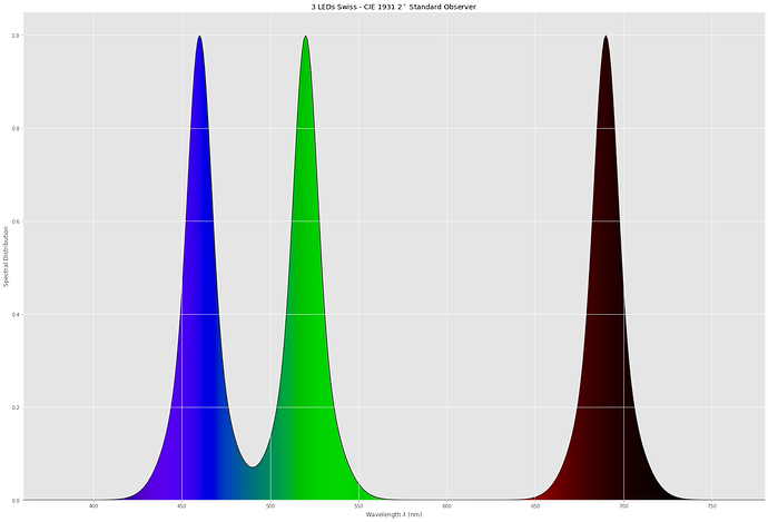
Specifically, I am using data from the Diastor paper “Investigation of Film Material - Scanner Interaction, Flueckiger et.al.”. The spectrum turns out to look like this:


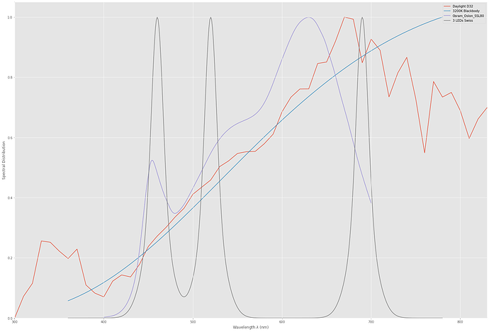
Or, in comparison with the other spectra:

Note how far in the infrared region the Swiss red LED is sampling. Probably not a good idea. We will see soon…

So - this ends this post for today. As time permits, I will post more on this subject - including on how to simulate a camera by folding various spectra with each others. If somebody wants to read ahead, check this link (this page is talking about digital cameras and LED walls - a task very different from a scanner calibration, the one we are really interested in) and the ACES paper linked on this page at the bottom (I took this paper as a basis for computing the color science of the scientifc tuning file)
2 Likes

For a while I’ve been thinking about running a simulation all the way from simulated “real life” objects, captured on simulated film (presumably using the Kodachrome absorption curves that Kodak published), then re-captured through various simulated lighting setups using the kind of spectra you showed above along with some published sensor response curve.

I haven’t had any time for it yet. (I’ve been busy with automated IR cleaning of Kodachrome and hope to report some cool results on that soon, instead!)

But, at least for that first simulation step, I’ve found a nice database of real subjects captured multispectrally at 10nm intervals. There is a “single zip file” link on this Columbia University page with a nice dataset of images to begin with.

One of the eventual experiments of such a simulation would be to virtually fade one or more of the dyes before the simulated camera sensor capture and then see how much or little can be restored later.

Not having performed the experiment yet, my hypothesis is that–at least numerically in our perfect simulation environment–white or narrowband will both be able to correct things all the way back (within some tolerance). But, if noise is added between the simulation stages (especially to a particularly faded ink channel), narrowband will outpace the results of the white light. That’s only gut instinct though and I would be happy to be proven wrong if it meant we could finally reach a consensus on the topic! :sweat_smile:

1 Like

Well, that was my initial approach actually. But here important non-linearities come into play (film density as a function of exposure). Besides that, the necessary data is hard to come by. Besides, I have at least two different Kodachrome films where one or more 15 m rolls show a greenish tint - most probably some variation in the developement process of the rolls. So feasibily as well as usability of such an approach seem to me to be rather limited.

Thanks for that link - might be interesting to check it out in detail. Usually, it is not that easy to convert such custom data into something usable for your specific software environment. I am using the Python Colour package and spectral data with 5 nm spacing, this data base features 10 nm spacing. While this can be handled, it’s still a lot of work processing such raw material.

Speaking of a lot of work: most of the spectral data I have was digitized from diagrams. That is no fun either…

Well, yes, I think that wideband and carefully chosen narrowband LEDs (not: the Swiss selection!) will yield with appropriate camera calibration nearly identical results. The noise issues are a slightly different and rather complicated topic. For a start, a faded dye will push more light into the sensor than a not faded dye. So sensor noise might not be the primary issue here - I suspect that quantization noise has to be discussed here as well, since the signal variation is reduced in the faded channel.

Well, scanning faded film this is an active research area. Here are some a list of some links to papers about that subject. Due to time reasons, I have read only one or two of these (so: no guarantee that these papers are really worth reading!):

As I do not have a lot of faded film stock, I tend to live with what’s available and, if that is not of sufficient quality, I even tend to throw it away in the final grade. Mostly, it’s unimportant stuff (like a not very interesting scan over a landscape). Up to now, that happened probably to at most 30 seconds of footage in total. That’s the reason I have collected the above papers, but have not yet read most of them.

3 Likes

Hmm. That does throw a bit of a wrench into the gears. And there aren’t any good known estimates of that transfer function?

Oh, is that another database of images like this one? I found the Columbia one after just some cursory preliminary searching. 5nm is better than 10!

Do you mean graphs? I’ve had some success with WebPlotDigitizer in the past. (It looks like they have a newer, paid version since the last time I looked. It apparently uses AI features to detect and do the same job in just a couple clicks.)

There are quite a few here I haven’t seen yet, either. That 3rd link looks interesting. (Trumpy publishes a lot!) The idea of “digitally unfading” the ink has been tantalizing ever since I saw any mention of “crosstalk”. I’ll have to check some of these out more carefully. Thanks for those!

There is some data available. The question is: how correct is that data? And whether it’s worth the effort. I do think not really so, see my comment above about variations encountered even in the rather standardized Kodachrome development process.

Also, examining color processing at level of the S8-camera’s film stock, even if it could be done perfectly, would aim to yield the original colors of the scene. That is, the film’s characteristic would be totally lost, for starters. And remember that at least with consumer film, you basically never had a good match between the color temperatures the film was supposed to work with (only “daylight” and “Tungsten” available) and the real illumination - being quite often a mixture of various light sources with different characteristics. So you will probably never end up with the real colors of a scene. That is, the part of “simulating the analog film response” is probably a rather academic exercise…

Actually, real images are not really a thing to start with. Multispectral images tend to record the combined illumination and surface spectra - how to separate them reliably? What about glint and color spill during the actual picture taking? Using a camera for spectral records is probably not the best idea for recording spectra.

The only thing we need here in this topic are spectra. Here’s a link to a larger dataset with 190 patches. I am sure there are be others available on the internet as well, but I have not looked. Personally, the data set of the color checkers included in the Colour-lib have proven sufficient for my taste. Actually, in my tests, optimizations with 24 patches generally yielded better result than optimizations with the full 190 patch set. Citing the page I have linked above: “Characterising a camera [via color patches] so that it produces faithful colours is a blend of science and art.” I bet you walked that line as well with your scanner calibration, using Argyll as software.

Yes, I ment graphical data grapped from data sheets available. And guess what program I am using since a few years - WebPlotDigitizer in a local install. :innocent:

Well, sure… but that’s exactly what this is, isn’t it? :joy:

The simulation doesn’t need to capture every facet or variation that you might have run into in the real world. I was just hoping for something close enough to reality to answer the single broadband vs. narrowband question. It feels like we could probably concede some simplifying assumptions in that case. (Say, instead of worrying about exceptional cases, just explore the typical one, etc.) It feels like a model like that would still have value.

Even if the dye density data is only mostly-correct, that’s still better than nothing and it might still help contribute to answering the question.

Again, my interest here is being able to make visual comparisons of real scenes (like your additional Heidi example or, better yet, Figure 3 from that final paper you linked above). Color patches are fine for quantitative evaluation–which we should definitely also be checking–but there isn’t anything quite like looking at a side-by-side comparison of two images to know whether you’re on the right track.

I am reminded of Anscombe’s quartet. Color patches are like only looking at the regression lines. I’d rather see all those data points!

1 Like

Well, let’s specify the scenarios:

Complete Simulation: here, you start with a given virtual set, compromised of various spectra of objects in the scene, plus of course the illumination spectrum. Using this data you can estimated the spectra the simulated S8-camera is “seeing”. Dropping the influence of the lens, the next thing to consider is the daylight filter which was traditionally inserted into the optical path when recording an outside scene. Of course, for artificial illumination, that filter would be moved out of the path.

The incoming light spectrum would need to be filtered by the films color filters and than be subjected to the non-linear transfer function, arriving at some densities here.

During the development process, the exposed film is converted to varying dye densities. As far as I know, certain chemical tricks would be applied, influencing the appearance of colors. Basically, to get bluer sky then originally possible, for example. These kind of tricks would not show up in exposure-to-density graphs, by the way.

Anyway. Let’s assume one can get a close enough representation of dye densities of the scene. Using the hopefully known spectra of the dyes and combining them with the spectrum of a projection lamp, one could calculate the spectrum of each scene object projected onto the screen. For normal S8-projectors, actually a simple blackbody radiator would do fine - no need to guess this.

Now, for ultimate precession, one would have to include the spectral characteristics of the screen. For simplicity, let’s assume it’s a silver screen - that is, we simply do not model this step.

Anyway. The spectra at that point in the computing chain should represent the input data the viewers in the old days would be viewing. The colors perceived will not be the original colors of the scene. I have mentioned a few obstacles, but there are more.

Anyway. At that point of the chain, a link (that is: a transfer-function) between the scene colors seen by a human observer and the original scene colors might be established. That would allow the recovery of the original scene colors of a scene (or something close to this). But: do we really want this? First of all, I highly doubt that this is a feasible way to compute things. From my experience there are just too many unknowns and variations here for this to succeed. Secondly, even if that task would succeed, we would take away the characteristics of the S8-film material - which is in my view an important aspect of historical footage. In a good scan, you should be able to differentiate between Kodachrome and Agfachrome, for example (in my old photography days, I intentenally selected different film stock for certain photographs. Blue sky → Kodachrome, lot’s of green (forest) → Fuij, more brown tones (wood) → Orwo (an East-German film brand), and so on…)

Perceptual Simulation: This is the way I am concerned with. This is much simpler than the above sketched scheme and starts right at the point where the complete simulation left off: the image projected onto the silver screen. It is assumed that this image is close to the original scene’s colors, due to the magic of analog film and its processing. And, in the old days, this was what the audience experienced. In my opinion, the task of digitization is to come as close as possible to this experience. Technically, it boils down to align the scanner camera’s response as close as possible to human color perception.

A trivial way to approach this is to treat the image on the silver screen simply as “scene” given. After all, this what the viewer saw in the old days.

Well, this was my approach when creating the scientific tuning file. The hidden assumption here: if a camera maps spectra of arbitrary normal scenes faithfully, it would to the same with the “scene” being the light pattern on a silver screen.

Clearly, at least in the simplified scenario, the generic question of how good a camera can be calibrated with a broadband illumination vs. a set of narrowband illuminations can be answered with general color targets. With respect to film dyes - which might have spectra quite different to what is occurring in nature’s repertoire - one would need to dig a little bit deeper. One way I see is to postulate a certain color and calculate with given film dye spectra the film densities of the color channel in question. Than, using these densities as a basis, one can calculate the optimal transfer-function of the scanner’s camera.

At this point in time I think that narrowband scanning works because the typical film dyes do not have a too weird spectrum. They are usually rather smooth varying functions. So the chance that a narrowband filter just samples at a point where the dye response as a peak or so are rather low.

But generally, we are comparing an approach which samples over a large range of wavelenghts (broadband) with an approach sampling only on three discrete points. As argued before, that should work most of the time, due to the low variations in typical dye spectra.

Well, I disagree here. There’s a difference between working with established metrics, optimizing a signal path with known properties, and a “judging by the eye” technique - which you necessarily have to do in the case of faded film stock. I would even go so far that you never can recover colors correctly in an algorithmic way. You simply have no information on how the film stock faded over time - that will be different for each film stock encountered, each storage condition experienced, depending on the amount of time which has passed.

So in the end, you will end up with visual comparisons - and at least my judgements tend to differ from day to day.

Overall, one has to ask whether some technical effort is advisable when the only reference for optimization will be in the end one’s personal taste.

Reminds me of old lectures I have given about statistics and robust estimators. But that was about 30 years ago… :slightly_smiling_face:

However: intrinsically, camera’s operate in linear space. They should do so, as colors do the same, mostly. That’s the main point of Daniele Siragusano’s video (skip to 07:20). Outliers should be expected in color calibrations based on calibration targets. Also, you might find certain colors (skin tones for example) more important than others - in that case, the calibration would be tweaked a little bit. And one enters even with calibration the realm of art (or: personal taste).

Thank you for taking on my suggestion to start this topic/discussion/simulation/experiment, and to both of you for sharing your insight and knowledge in the subject.

In my view, this is the core issue of white vs narrow RGB. The views, as I best understand them are:

  • RGB narrow: The scene captured in the film is quantified in/as the CMY dye values recorded. If one can extract these, with as little crosstalk as possible, as their RGB transformation, it is the best scanning possible (according to Diastore). Narrow-band RGB LEDs serve this well, the capture sensor spectrum is irrelevant, as long as it includes the ability to quantify the bands of the three narrow-band LEDs. Interaction/bleed/crosstalk of the CMY components is made as irrelevant as possible.

  • White: The scene is captured as to provide the viewer a broad-spectrum representation resulting from what the CMY components left over, rendering colors that will be perceived as the original scene. The CMY components subtraction is imperfect, and these imperfections (bleed/crosstalk/interaction) are embedded and integrated by the viewer perception. Edit: The color representation is defined in part by the RGB spectrum sensitivity bands which make the RGB transformation.

In both cases, the scanning creates a digital representation to subsequently drive a display (typically with RGB LEDs) and reproduce the film image for viewing.

An additional way to look at the problem is to simulate the core difference.

If one agrees that the narrow band LEDs are faithfully quantifying/separating the density of the CMY components, then using the film transmissive spectrum, it should be possible to simulate the left-over spectral components (which must include the CMY crosstalk specified in the film datasheet). That broad spectrum simulated result is then filtered by each of the color-sensor RGB spectrum sensitivity bands and quantified as RGB.

The differences between the narrow-RGB, and the broad-left-over RGB, and how these two differ when presented/perceived via an RGB display (what is better or worst of each), is -I believe- the substantive core of the white vs narrow-RGB debate

1 Like

When you just sent your roll of film into Kodak for processing your home movies, they’d go as far as this sort of thing? Or did you mean these tricks were available if you were developing it yourself for, say, a film project? Again, I’d err on the side of the “default” development process, ignoring anything out of the ordinary.

That is all I want. I want a video file that most closely matches what it would have felt like to perceive the scene in person, standing next to the person holding the camera.

I guess, what do you mean here by “succeed”? Will it be 100% perfect? Never. Is getting closer to the “ground truth” original scene colors better than being farther from them? Always. This is a sliding scale and I want to get as close as we can within the capabilities of our hardware and math.

This is very interesting! I believe this might be another fundamental philosophical difference between our approaches. Just like there are “grain must be captured” vs. “the grain is just noise” camps, there appears to also be separate “I want to see what the projector would have shown the day it came back from being developed” vs. “I want to see what the people in the scene saw at the time” camps.

For creative endeavors (which your intentionally selected film stocks may fall under), there is plenty of reason to prefer the former. Filmmakers choose to tone/tint their scenes all the time to establish various moods. I suspect this is one of the reasons most Trumpy/Flueckiger papers focus on restoring the original intent of the film’s colors. The material they’re interested in digitizing seems to be feature films. I also suspect another motivator for choosing that camp is nostalgia: you have spent considerable time viewing these original materials via a projector and recapturing that experience is meaningful.

From the other side of the fence: I am from the following generation. 100% of the footage I’m scanning was shot before I was born. I’ve seen it projected (onto our kitchen wall) exactly once when I was a teenager in the 90’s. There is no projector nostalgia and these weren’t creatively, deliberately shot films. They were shot amateurishly (with lots of shaking, too fast pans, often out of focus) to capture some event or other memory. Most of my audience will be the children of the recorded subjects that also weren’t present (or alive yet).

In the same way I fight against the film grain to retrieve important content details, I am also fighting against the characteristics of the S8-film material to retrieve important color details!

Didn’t you just say “… there are just too many unknowns and variations here for [recovery of the original scene colors]…” in the preceding paragraph? I suspect I missed a subtle distinction.

Unless the film has faded at all in the intervening 50 years.

I know we’ve discussed this previously and yours haven’t. For my part, correcting fading is the most important feature of this lighting question. Just capturing what is presently on the film is the easy part for both lighting methods. Even if one method only makes color restoration slightly easier while every other result comes out exactly equivalent, it would still be worthwhile.

I agree that is one of the critical features. If the film dye responses were unusual or otherwise not well behaved, the only feasible answers would be white light or hyper-spectral scanning. (It is a great boon that they are such smooth curves.)

Come on, you even quoted the part where I also said we should do it numerically. :sweat_smile:

Along the lines of the Anscombe quartet, I was going for a “trust, but verify” idea there.

There is a joke among videogame programmers that if you can’t get a 3D object to render the right way, you begin flipping negative signs in your various equations until it shows up correctly.
The last thing I’d want is to work hard on some formula that promises to restore things 99% of the way only to find that when you run it on a real image everything turns out looking strange.

At least for my part I need visual feedback every step of the way just to root out mistakes in my own code/math. (Perhaps I make more mistakes than most?)

I’m happy to run all the data we can get our hands on through this simulation: patches, images, whatever. :slight_smile: Really, what are these multispectral image datasets besides height x width color patches?

If your experience with color grading has been anything like my own so far, I suspect you’ve run into both of the following kinds of situations: some scenes (for me, outdoor Kodachrome) barely need the slightest nudge of any color wheels before they look excellent. But other footage (exposed incorrectly, faded, etc.) seems to require a great deal of effort and tweaking before you’re barely able to get something passable that still seems to have an unusual color cast somewhere that you just can’t seem to get rid of. When you get the skin tones looking right, something else looks wrong. You go back and forth, chasing your tail.

I’m not worried about my color grading taste. Everyone’s is different and I agree that it changes day-to-day. I am worried about transforming the latter kind of footage even the slightest bit closer to the former. If some automatic process can get things closer to natural looking color so the grading process becomes closer to effortless, I’ll take the creative/subjective decisions from there.

I intended the quartet reference only metaphorically, not literally. “Trust, but verify.” “Always look at the data.” Etc.

Sorry for any confusion.

I’m also really just a (persistent?) layman here. @cpixip has way more experience here than I do along several axes.

Those are both excellent summaries.

Yes, precisely! But, critically, the narrow-band case allows for adjustment (e.g., for faded material) before simulating the left-over spectral components. In the broadband case, everything is already tangled together.

Here, I would actually disagree. In both cases it doesn’t take too much effort to calibrate either lighting method (given something like the scientific tuning file or a calibration target). Should I choose to present my film scans “as-is”, straight from the 50 year old film, I don’t believe they would differ substantially from the results of a similarly calibrated broad-band light scanner. (@cpixip said similar, above: “…that should work most of the time, due to the low variations in typical dye spectra.”)

My understanding is that both approaches are tools that have trade-offs. (The most obvious: it is certainly easier to stick a single light behind your film!) The substantive core of the debate for me is: does narrow-band scanning provide any capabilities to work with this footage in a restoration capacity that the other can’t match? Is narrow-band scanning a more unwieldy tool that can permit more sophisticated/accurate/“original color” results… or is it just unwieldy with no major advantages over broad-band scanning?

And I believe a simulation like the one we’ve been discussing could help us get closer to answering that question definitively.

2 Likes

Calibrate what is captured that is. What was dismissed by the narrow bands -the wide left-over of the white LED- is no more.

I would agree with the premise above, if the processing pipeline of the narrow RGB would determine the density values of CMY for each pixel, simulate a broad-spectrum illuminant, subtract from that illuminant, and separate the typical RGB bands perceived by the eye. If the output of that processing pipeline is calibrated, I would agree.

I would add… and what would be the well known the trade-offs.

Actually, it is easier to find narrow band LEDs and adjust these to a set intensity, than to find a good white LED.

Agree. What hasn’t been well defined, quantified is… what are the trade-offs.

To better understand these trade-offs, and if possible, better quantify them, is the part that I am most interested.

There are commercial scanners that have RGBW illuminant. I do not see it as an either-or.

My LED DAC/Drivers design is for both RGB and White. Actually, the plan is to experiment with 7 bands + White. Given my budgetary limitations, I will continue to use a color sensor, using the camera raw-color band as a fullish-spectrum relative to the narrower LED band.

An early hypothesis I posted is that the best of both worlds may be a W-RB scanner (Y-RB), which would provide more visible information (a better G than the narrow band LED G) and better color separation than white only, at the same time. That still 3 LEDs, and can be done with a monochrome sensor.

In summary, the White / RGB deep dive, at least for me, is about developing a better understanding of the two, so as to determine how to combine these to minimize the trade-offs of each.

1 Like

I remember reading about something like this in a book tens of years ago (before the internet). I might remembering this wrong - it’s been quite some time since I was concerned with the chemistry of analog color films. But film stock is usually quite a bit more complicated than simply three dye layers.

What I am sure about: in the old days photolabs tended to throw into the negative-positive process just a little bit too much yellow tint. Why? First it would make the photos “sunnier” - which customers preferred, second, it would easily cover up mistakes in the color balance which would otherwise be noticed even by layman.

I don’t know too much about these things, but they were there in the old analog times.

Nice goal, but is it really realistic? For starters, you won’t find a digital output device which even touches the dynamic range your eyes are able to operate with. Besides, there is not (yet) an established way to encode such data in a video file.

Furthermore, even the best digital cameras do not record the colors of a scene correctly without carefully controlled illumination (see below also my “Petra Jordan” example). There is a reason why professional photographers do not depend on any whitebalancing algorithm available in cameras.

Your human visual system is taking into account all different kind of things which occur in peripheral vision - this information is simply missing in the small movie frame. Besides, film and photography was always intended as an art form (many of the early photographers were originally artists). The camera’s frame is important and transforms reality into something new, simply by cutting off the rest of reality.

Nope. Sometimes computations and theories fail - quite often because they are based on too optimistic assumptions. Other obstructions can be false, missing or “beautified” data - you never know. The amount of work which would have to be put into the endeavor we are discussing diminish in my opinion the chance of achieving any worthwhile improvement…

That’s an intrinsic part of the problem - I touched upon this before. Let me try again to elaborate: in commercial film production, color was a carefully controlled property. There was a time where these color specialists were even listed in the film credits. For this type of material, your endeavor “recreate the original scene’s color” would most probably even be a viable option - provided, one could get the data of the original negative film, the various analog intermediates plus the final projection copy. But: typical S8-film stock was used in an uncontrolled illumination setting, most of the time even in a mixture of different light sources. If there would be a capture of a color checker somewhere, you absolutely would be able to come close to the original scene colors. But of course, usually consumers didn’t bother to carry something like this around.

Even in today’s digital world, things are not as easy as they seem. Do the following experiment: google “Petra Jordan” and compare the colors of a number of images the search will turn up. All of them digital images. Not one of them is showing the “true color” of the sandstone there - or?

Well, I thought you want to get to the “original colors of the scene” which is equivalent to “fight against the characteristics of the S8-film material”. Nevermind. :upside_down_face:

Well, there are two scenarios: the “original colors of the scene” - which means that the transformation from scene to projected S8-image is taken away, and the “colors of the projected S8-frame” - which takes into account the characteristics of the film medium. To make this difference obvious. If the S8-film in question uses a black-and-white film stock, you would not be able at all to recover the original colors of the scene. But of course, you could still strive to digitize the black-and-white S8-frame and encoded it in a (in this case not necessary) RGB-video format.

Absolutely true. But again - the few papers I skimmed over presented only “good guesses” instead of real answers, even tied to very specific film types. Nothing about the few Ektachrome film stock I have as material.

Film fading is certainly dependent on the film type, but also on the storage conditions and times exposed to that condition. How in the world would one handle or account for that? My own films moved over the time to several places. In none of these places there was a controlled environment, not even temperature, forget humidity. I have one big S8-movie (over 1h long) which was developed more than a year after the footage was exposed (luckily, this is mostly Kodachrome). At this point in time, because of the large number of variables, combined with a lot of unknowns, I do not see any chance of developing a trustworthy way to recover faded film stock. In the end, you will set the color “right” utilzing your own eyes/taste as instrument.

Of course :innocent: I just think the effort of a thoroughly study and, if successful, a nice algorithm to defade that old footage is doomed to fail, for reasons elaborated above. So the easy solution is “judge by your eyes”, that is, just a little more effort in color grading.

there’s a trick for improving skin tones with the Color Warper in DaVinci. Mark selectively only the area of the footage which you know are representing the skin colors. Then move these colors onto the skin line. Most of the time, that works well.

Well, just a few random thoughts as well. Narrowband scanning is probably more a signal-processing way of approaching things than anything which takes color theory into account. If the three sampling channels are well-placed, the signal variation of the dye layers might be captured better with such a setup than with a wideband illumination. Since we throw away a lot of the original information available in a full-spectrum scan, actually noise issues (especially quantization noise/film grain) might be more annoying than in the wideband case. Also, perfectly placing the three narrowband channels is a challenge - a challenge I failed at least once, with my first illumination setup. The averaging nature of a wideband scan might be helpful here as well. A multi-LED setup with more than 3 channels would have here also an advantage: namely the possibility of changing interactively which set of LEDs one is using.

The “signal processing” approach advocated here is - at least in my opinion - currently only rooted in the not really substantiated claims made in the DIASTOR paper. They just make rather unconvincing statementa about this - I am not aware of any real research done along these lines. If someone in the community has some better papers, I am happy to read them.

I think it is important not to neglect the fact that we are talking about colors. And colors of surfaces are not only three numbers. They are functions, namely the full spectral function over the range of the visible wavelengths (at least). And crosstalk is not something one wants to avoid in this respect - all the intermediate colors located between the full primaries are in principle “crosstalk” (of the primaries).

As argued before, sampling an arbitrary function at only three places in the spectrum and claiming that this delivers a correct description (encoding) of the spectra is kind of wild. Enter in Excel three data points, graph them and than add a trendline - use any of the options, for example polynomial, and play around with number of terms. You should be surprised on the different “fits/guesses” one can generate this way.

The point I want to make here: sampling narrowband signals is an inherent unstable way of dealing with spectral data. It might work, but there is quite a good potential of failure. Due to the averaging nature of the (broadband) spectra → color value computation in a camera, paired the similarity of this process to what the human visual system is performing (CIE 1931 standard observer), I have the feeling that is a preferable way. But at this point in time, I do not know for sure. I suspect that the rather broad spectra of the dyes save us the day here - I hope to come up with some simulations sometime, but I am not there yet. For starters, I have to get my hand on some dye spectra of common film stock. My current idea is to create a virtual color checker based on these film dyes (nit the combination ofvarious paints foundina standard color checker) and than check the performance of broadband vs. narrowband scanners on this.

But before that, I plan to add to my initial post about lightsources, colors and spectra a “post2” talking about simulating human color vision and a “post3” talking about simulating digital cameras.

1 Like

Following part1, this is part2 of a little series. Part3 can be found below.

In part1, we had a look at the spectra of various illumination sources and object surfaces. What our eyes or - alternatively - lenses of a digital cameras see is the combination spectrum of light source and object surface. That is, for every wavelength independently, the product of the light intensity is multiplied by the percentage of reflection of the specific object’s surface.

It is this combination spectrum what creates color perception in humans and digital cameras. The former will be the subject of this part, the later will be discussed in part3.

Let’s recap shortly. The standard illumination, used for example for proofing in the print industry, is D65 - an illumination very close to a sunny day outside, with a few scattered clouds. This spectrum looks like this:

This illumination features a color temperature of 6500 K. The spectrum of a whitelight LED will look quite different, especially if the color temperature is different (in this case it is 3200 K):

Now, the other kind of spectrum we are concerned with are the spectra of object surfaces. Take for example dark skin:

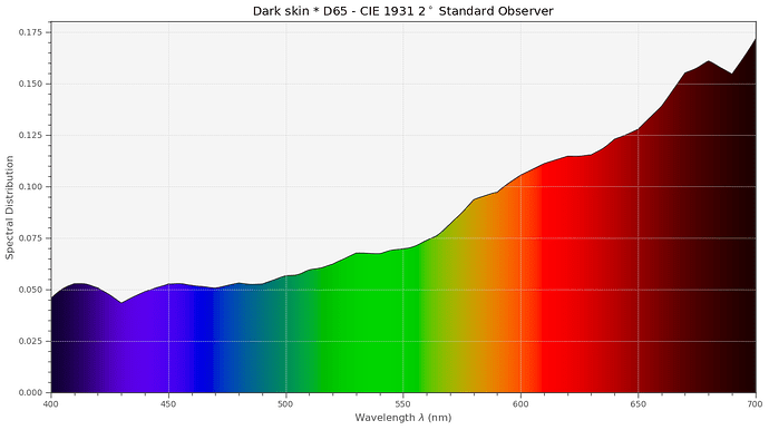
To arrive at the spectrum which our eyes see (or the lens of a camera), we have to multiply the illumination spectrum present with the surface spectrum. Again, every wavelength is to be handled here independently. With D65, we get that combined spectrum for our dark skin example.

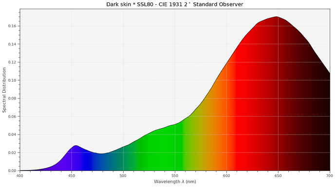
With the Osram SSL80 LED, we get instead this combined spectrum:

Surprisingly, both spectra look quite different.

But, a “dark skin” patch included in an arbitrary scene would practically perceived in identical colors - irrespective of the illumination (D65/SSL80) chosen. How can this be? Well, we have to take another property of human color vision into account, namely chromatic adaption. This is the ability of the human visual system to discount the “color” of the illumination and arrive (most of the time) at the pure color of an object.

In a sense, chromatic adaption is similar to the auto-whitebalance algorithms in a digital camera - only much more efficient. Throwing into the pipeline a chromatic adaption transform (“CAT” - I am using the linear Bradford method), we get the following color perception under varying illuminations:

Again, the inset “CIE 1931” shows the color appearance under D65 illumination and serves as our reference. The left side of each patch shows the colors under a blackbody radiator at 3200 K, which would be very equivalent to a consumer projector lamp in the old days. On the right side of each patch, the results with an illumination with the Osram SSL80 white-light LED are shown. There are differences, but they are quite tiny and only visible because we can directly compare in the above diagram. If viewed separately, say in different room setups, no one would notice a difference.

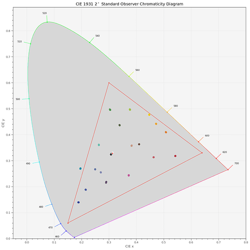
(A tiny sideremark: these color graphs are computed and displayed in sRGB-space, because this is the internet’s default color space. One of the patches, [17] “cyan” is actually outside of the color gamut of sRGB, as the following diagram shows:

The red triangle marks the border of sRGB’s color gamut. So the rendering of the cyan patch is somewhat lacking in all of these displays.)

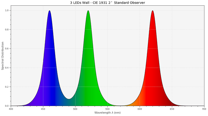
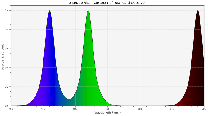
Returning to our main discussion: Let’s now throw into the simulation another, quite different light source: an LED-lamp based on the combination of three narrowband LEDs. Something like this here,


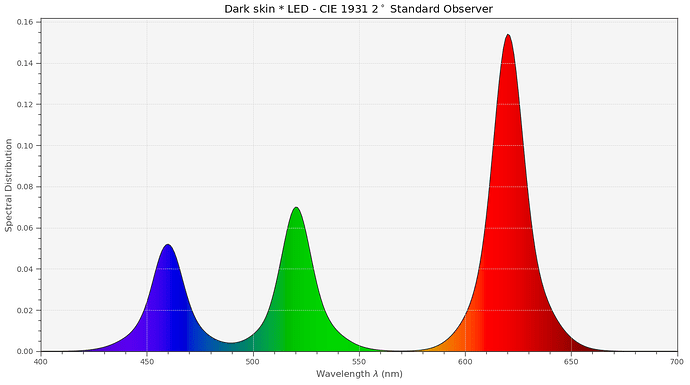
for example. If we play our “what spectrum arrives at the eye’s lens?” game again, we now get the following combined spectrum with the LED source:

Note that the shape and place of the LED peaks did not change; basically only the height of the peaks got adjusted by the interaction with the object surface.

Let’s see how this LED-illumination source performs in comparison to our other light sources over our full set of color patches:

Obviously not so great…

(The largest deviation with the LED illumination occurs in the orange region (patch [11]) because there is simply not enough energy in this spectral range, due to the gap between the green and red LED-bands.)

Quite generally, narrowband or spiky illumination is inferior to other illumination types for human color perception. This is the reason why sometimes clothing which color-matched in the store looks weird once outside. Or why the meat always looks better at the butcher shop than at home…

This ends our little exploration into how human color vision is working. In part3, we will look at digital cameras and how they see the world. And we will discover that we do have additional tricks in our sleeve which will allow us to improve a little bit the situation with respect to LED illumination.

2 Likes

The dress is the most famous failure of this system. It’s a great demonstration if only because this is so rare in everyday life. That this confusion isn’t happening all the time demonstrates just how efficient we are at adapting to various viewing conditions!

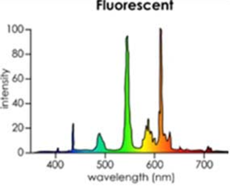
The main event here is how awful fluorescent lighting is. Check out this spectrum. :grimacing:

fluorescent

Until the last decade or so, that was the lighting in every hospital, store, warehouse, school, etc. That’s what you don’t want if you’re trying to make subtle distinctions between colors! :rofl:

2 Likes

Here is the third post in the series - some experiments on how digitial cameras see the world. In part1, we discussed the two major components of color perception, spectra of light sources and spectra of object surfaces. The spectra of light sources typically have a parameter called correlated color temperature, which can vary between very warm light (low cct) and very cold light (high cct). Luckily, spectra of object surfaces stay constant over time. In part2, the amazing property of human color vision to (mostly) disregard the variations of the light source and deliver the pure object color was discussed. That property of human color vision finds its limit mostly only with certain artifical illumination, either flourescent light or narrowband LED illumination.

Not too surprisingly, digital cameras employ similar processing steps to get close to the performance of human color vision. Let’s see how this is done.

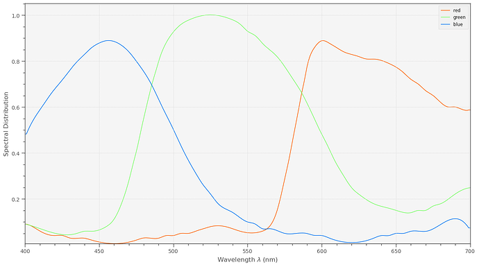
Like humans, cameras have three color channels. We will base our discussion/examples on the IMX477, the sensor which is utilized in the HQ camera. The IMX477 features a standard Bayer-filter in front of the pixels; the spectral sensitivity curves are shown here:


The color of the curves is actually an approximation of the colors of the filters - if one would be able to look through these tiny patches of color.

Some remarks are important at that point. Note how broad and overlapping the sensitivity curves are. That is similar to the “filter” curves of human color vision and technically important for the task at hand: derive from a continious function (the spectrum) a small set of parameters (3 color values) which describe the spectrum best. In fact, Bayer-filter are optimized within the context of what is physically/chemically possible to make the camera response as close as possible to human observers.

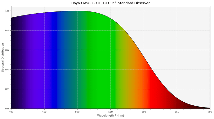
Another thing I want to point out is that in the extreme red region (above 660 nm) the green and blue filters become transparent again. In fact, if we would go further out (above 720 nm or so), all filter curves would become very similar, unable to yield any color information. This is not only with the IMX477 so, but with basically every other digital camera. That’s the reason for the IR-blockfilter one finds in basically any digital camera (or IR/UV-blockfilter). Here’s the filter curve of one of the two types of IR-blockfilter used in the HQ camera (earlier HQ cams used the Hoya-Filter, later models a slightly different one):


Surprisingly, the “IR-blockfilter” of the HQ camera does not only block IR-radiation, but also quite a wide band of other colors. Whether this choice is a commercial optimization or whether this helps with the color science of the sensor I currently do not know.

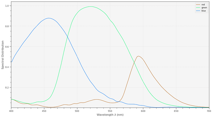
In any case, including the Hoya-filter into the signal path, we finally arrive at the sensitivity curves for the HQ sensor:

This is the data the scientific tuning file for the HQ sensor is based upon. Note how small the red component is in comparision with the other color channels. That is the main reason why red gain settings usually hover around 3.0, blue gains around 2.0, while the green gain is constant at 1.0.

Anyway. Folding these filter spectra with the combined illumination and surface spectra in a given scene yields immediately three numbers: the raw image which can be saved as a .dng-file via libcamera/picamera2. The .dng-file will however contain metadata which will normally be used by whatever program you use for “developing” the raw. Most specifically, an “As Shot Neutral”-tag which describes the characteristics of the scene’s illumination, and (in the case of libcamera/picamera2) a “Color Matrix 1”-tag, which describes the transformation from camera RGB-values into an appropriate standard color space.

A small insert is in order here: in the case of libcamera/picamera2, the “As Shot Neutral”-tag and the “Color Matrix 1”-tag embeded in the .dng depend on the tuning file used. So even if you are working directly with raw dng.-files, make sure to use the correct tuning file. The colors you are going to see when opening the raw will be defined by this data!

Ok, coming back to the way a digital camera sees the world. We already know on how to arrive at the raw image intensities. Usually, in a raw image, everything looks kind of greenish. Specifically, grey surfaces are certainly not grey. To achieve this, a whitebalancing step is next. This whitebalancing step is equivalent to the chromatic adaption discussed in the human color vision part of the series and gets rid of the influence of the scene’s illumination (most of the time).

In case an AWB-algorithm is active, that AWB-algorithm will try to estimate a correlated color temperature (cct) of the scene. This is in fact a very rough characterisation of the scene’s illumination, as we have discussed before.

Once the cct of the light source has been estimated, appropriate red and blue gains (green gain is always 1.0) are computed and applied to the raw image. How this computation is done is written down in the tuning file of the HQ sensor.

If manual gains for the red and blue channel are set, the cct of the scene’s illumination are computed from them - again, these computations are based on information stored in the tuning file.

Ideally, once whitebalancing is performed, we arrive at an image were grey surfaces are grey. But usually, this image (I call it in the following camera RGB) looks rather unsaturated. Certainly, the colors are not yet correct.

This is rectified in the next step, were the camera RGB values are mapped into a defined output color space, say sRGB for example. To accomplish that, a 3x3 transformation matrix is used. This matrix is usually called compromise color matrix (ccm) and it is indeed a compromise: you cannot map all colors to their correct places all at once. If you want optimal blue colors, your skin colors might suffer and vice versa.

The ccm which is most optimal depends on the color temperature of the scene. So this is what is happening: once the color temperature has been estimated, libcamera/picamera2 looks into the tuning file, were a set of different optimized ccms for various ccts are stored, and interpolates a ccm from the two stored ccms which match the estimated cct best. The ccm computed in that way is actually the matrix stored in the “Color Matrix 1”-tag of the .dng and will be very the matrix used by your external raw developer as well to display your image.

In any case, once that matrix is applied, we should end up with an RGB image in a defined color space.

Since that journey was quite complicated, let me summarize this again:

  1. Capture of the raw image. Basically, the combined illumination and object surface spectrum is filtered through the Bayer- and IR-blockfilter of the sensor.
  2. Estimation of the color temperature of the scene. This is done either through AWB-algorithms or by manually setting red and blue gains.
  3. Whitebalancing the raw image. For this, we need appropriate red and blue gains. We either set them manually or they are computed from the estimated cct. The gains are stored as “As Shot Neutral”-tag in the .dng which will be produced.
  4. Transformation into a standard color space. For this step, a compromise color matrix is computed, based on a set of ccms in the tuning file and the estimated color temperature from step 2. The ccm computed is stored in the .dng-file as well, as “Color Matrix 1”-tag.

We are now in a position to check how good the HQ sensor combined with the scientific tuning file performs. Here’s the result of a scene illuminated with daylight (“D65”) and with a Tungsten lamp (“Blackbody 3200 K”). Again, the center part of each patch shows how a human observer would see the different patches in daylight:

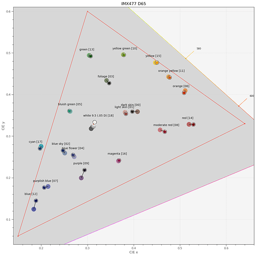
Well, this result is excellent, at least for a 50€ sensor. By the way, the estimated ccts were 6505.95 K for D65 and 3200.00 K for the blackbody 3200 K light source. Here’s another type of display showing the differences of how a human observer would see a scene vs how the IMX477 combined with the scientific tuning file sees the scene:


In this diagram, each black circle indicates the color perceived by a human observer, the filled circle shows the position in the xy-diagram of the color the sensor saw. The red triangle indicates the sRGB gamut, note that the cyan patch [17] is outside of this gamut.

Continuing our journey, let’s see how a wideband LED illumination (Osram SSL80, CRI 97.3 (of the published spectrum, not measured. The real one will be lower…, for details see part1 ) works:


We would get the results on the left (“Blackbody 3200K”) with a standard Tungsten lamp, similar to the type used in the old consumer projection systems. On the right side, the wideband LED results are displayed. Again, the color match between a human observer and both of these illuminations is excellent.

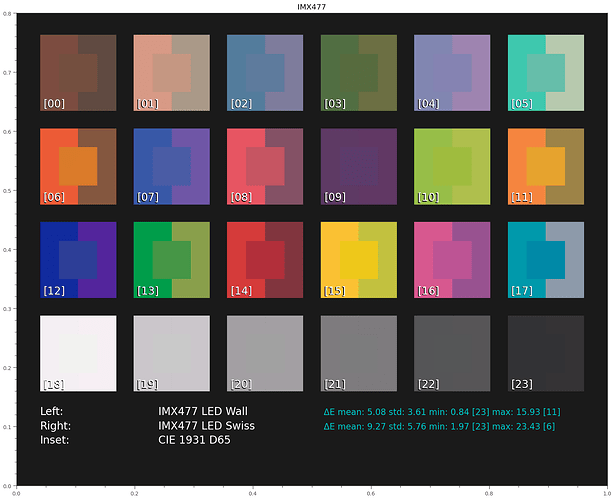
Now we are in a position to examine what narrowband LED illumination would achieve. Remember - this is a simulation where a virtual HQ sensor is looking at a color checker, driven by the scientific tuning file. The color checker is made out of different color pigments and is illuminated by various light sources. This is not the simulation we are actually interested in: a film transparency composed of magenta, cyan and yellow dye clouds, illuminated from behind by an appropriate light source. I do not yet have such a simulation setup.

Anyway. Let’s see how two different narrowband LED setups are performing. One is the “LED Wall” setup introduced before,


the other one is the setup which was suggested in the DIASTOR paper:

There’s obviously a large difference between these spectra. Specifically, in the Swiss case, there’s no signal energy at all between about 560 nm to 660 nm - where the orange tones are located.

Simultating this setup, we get the following result:


Not so good. While the cct for the LED Wall was computed as 6621.94 K, the cct of the Swiss LED ended up as 8600.00 K - which is just an indication that this not really a natural spectrum.

Note the failures especially of the Swiss setup in the orange tones, as expected.

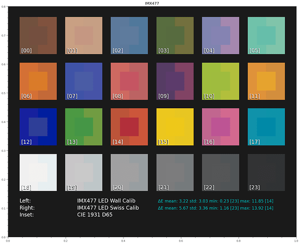
As already remarked, in case of digital cameras we have yet another option available: a direct optimization of the ccm via calibration, bypassing the ccms of libcamera and its tuning file.
(disclaimer: my optimization is not fine-tuned in any direction. And it uses only a 3x3-matrix - more advanced features are possible).

Let’s see how this works out:


Ok, we see an improvement, as promised. So this is obviously also a way to go. I do see issues in any of spectal ranges were the narrowband setup does not deliver enough energy. In the examples above, mainly in the orange-red range.

While we can improve the result of narrowband illumination by direct calibration, the low signals we end up working with in such badly illuminated bands are probably leading to increased noise characteristics for these colors.

In closing, let me note again that the experiments above are simulating a color checker with patches composed of various pigments, illuminated by various light sources, and “seen” by a HQ camera sensor. That is sort of similar to the setup we are actually after, namely a film frame illuminated from the back with a specific illumination. But I do see an important difference: the pigments of the color checker have probably different spectra lcharacteristics than film dyes. I am trying to develop such a simulation, but I am not there yet.

2 Likes

Thank you for taking the time to do this series, great material.

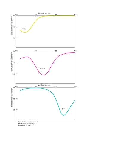
An idea would be to use the spectral-dye-density curve for each color dye and treat these as a filter to the broad-spectrum light (3200K illuminant for a projector).

The resulting dye-filtered-broad-spectrum-light, reflected against a neutral patch (the screen), would provide a relevant datapoint as to the nature of the spectrum received by the observer for each color dye, and the combinations resulting of the dye-band overlaps.

Note that the above is not the end goal of the back-lid-film to camera of the scanning setup. Ultimately, it is a relevant the reference point of what film renders as spectrum for human perception. And that reference point would be worth compared to resulting the scanning-display render, both with narrow RGB or broad-white scanning illuminant sources.

That is exactly my idea. Implemented this so far only partially; so it seems that the displayable color gamut of Kodachrome is actually quite comparable to the sRGB gamut…

Well, we will see whether this result holds up.

The main point I am currently trying to achieve: model a transparent, film-based color checker, where every color patch uses only the film dyes, not a combination of different pigments as in the case of a classical color checker.

The challenge here is that the dyes (and their spectra) mix subtractive - so some additional tricks are necessary. But I am pretty sure that I can calculate appropriate densities of film dyes for a set of patches. What I need at the moment is better documentation about Kodachrome and other film stock, especially good dye spectra.

By the way - your graphs look like idealized curves. The spectra I have seen so far do not show such perfect behaviour. I am in need for real measurement data.

1 Like

Is this a simple matter of the RPi HQ camera not being the right tool for the job here? Between the Bayer filters and the IR-block filter, a “deep red” channel is mostly going to be wasted (or at least require extreme gains, exposure times, or some other workaround).

I understand it’s a convenient and low-cost device (that seems to deliver quite a bit of value!), but it might make sense to model a different sensor for this case. One of the cool selling points of separate color channel exposures that doesn’t seem to be mentioned around here as often is all of the extra flexibility that you get. Two examples: no de-Bayering and you always get to capture with a gain of 1.0x (by adjusting exposure time for each channel). It removes some of the compromises… admittedly, at the cost of a few additional things you have to do manually.

One other bonus(?) is that steps #2 and #3 in your summary above get rolled into #4. There’s just generally less going on in the processing chain that you have to worry about.

This datasheet has the less idealized curves, right? Those are nice, vector plots so we can make them nice and large for WebPlotDigitizer…

Edit: Interesting internet find on government (then top-secret) characterization of various films.

The curves I posted are a breakdown of the datasheet @npiegdon referenced. Open these in libreoffice draw and one can take them apart/change the colors.