Kodachrome Colors

I want to report on some investigations about Kodachrome 25 film stock. My primary intention is to create a virtual color checker “made” out of Kodachrome film stock.

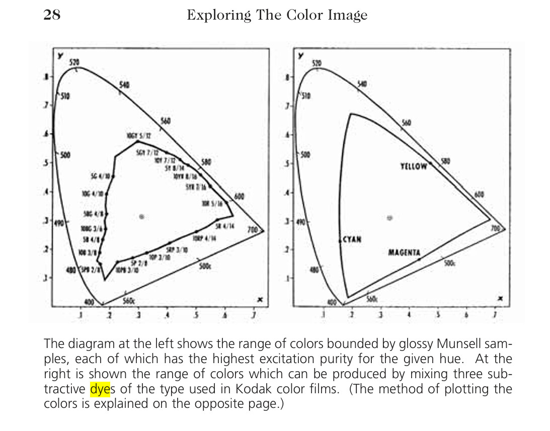
While doing this research, I stumbled over an internet page, “How Good Was Kodachrome?”, which is in part an interesting read. For starters, the page discusses the issue whether maximal color separation is a valid goal, or whether one should rather opt for overlapping filter channels (I support that later view).

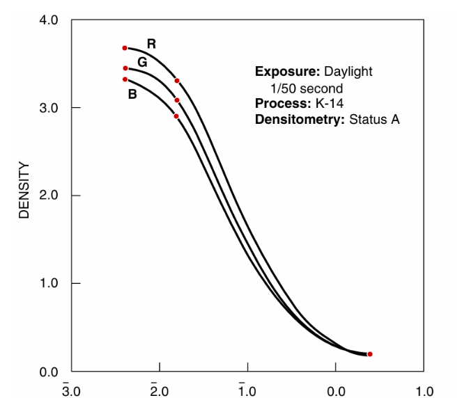
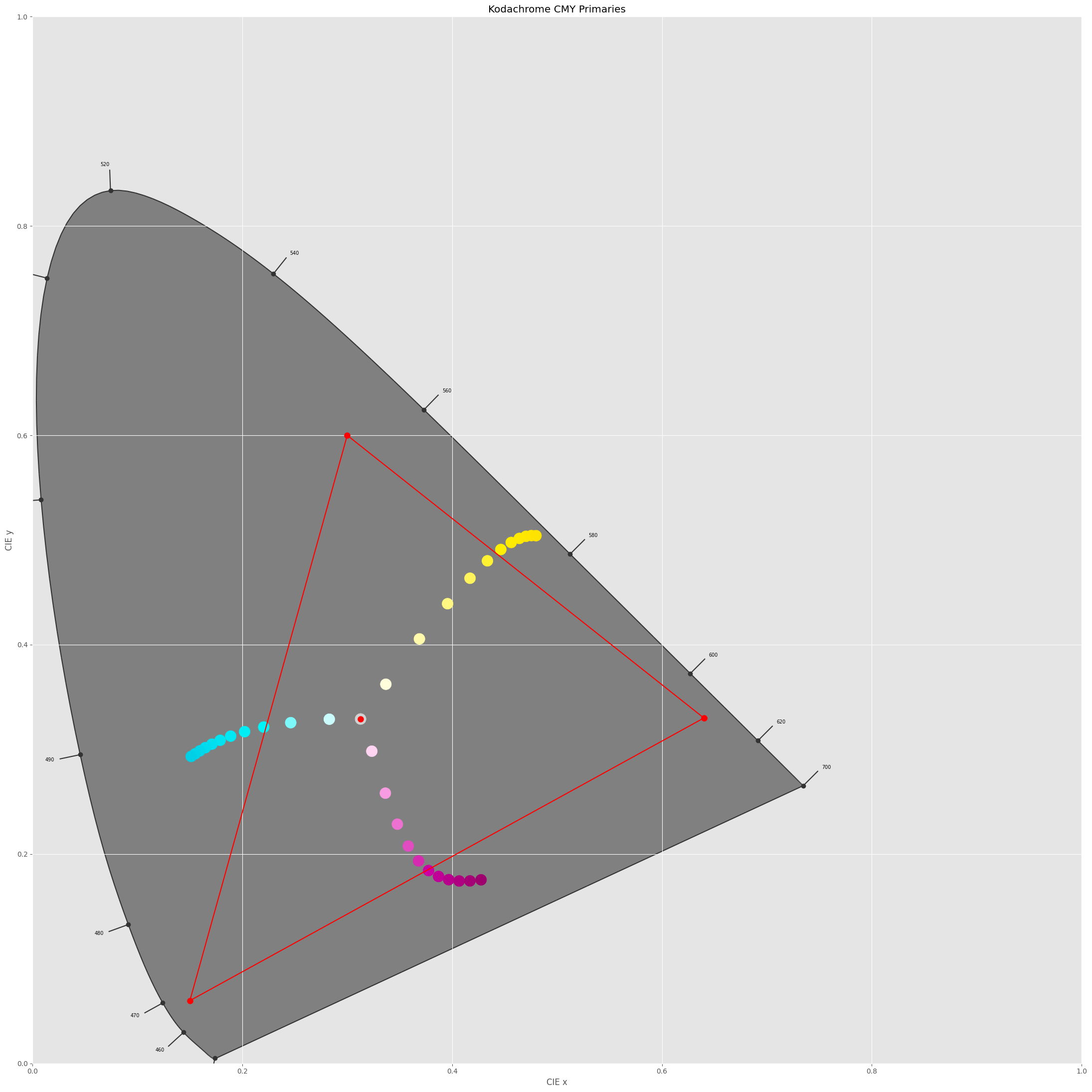
Anyway - I did the following experiment. From the Kodachrome 25 data sheet I took the spectral density curves of the yellow, magenta and cyan dye layers,

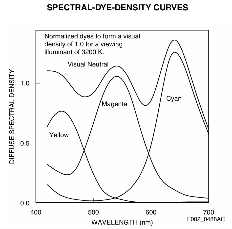
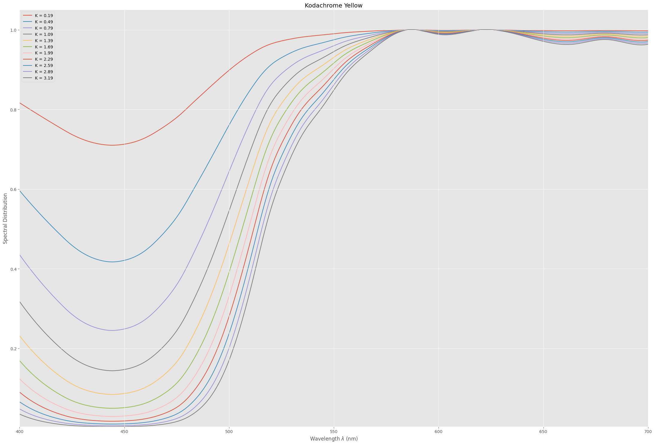
In order to arrive at a filter characteristc for each of these dye layers, I basically calculated 1.0 - d(lambda) (see below for an actual code segment). So the filter action of the yellow dye should yield a filter spectrum like this:


with equivalent handling of the magenta and cyan layers. In Python/colour science code, this is handled by the following code segment

    MagentaAbsorption = one - KodachromeM*scaleM
    CyanAbsorption    = one - KodachromeC*scaleC
    YellowAbsorption  = one - KodachromeY*scaleY

    totalAbsorption   = MagentaAbsorption*CyanAbsorption*YellowAbsorption

Here, KodachromeY is for example the spectrum of the yellow dye, scaleY is the density of the the yellow dye, and totalAbsorption the complete film absorption.

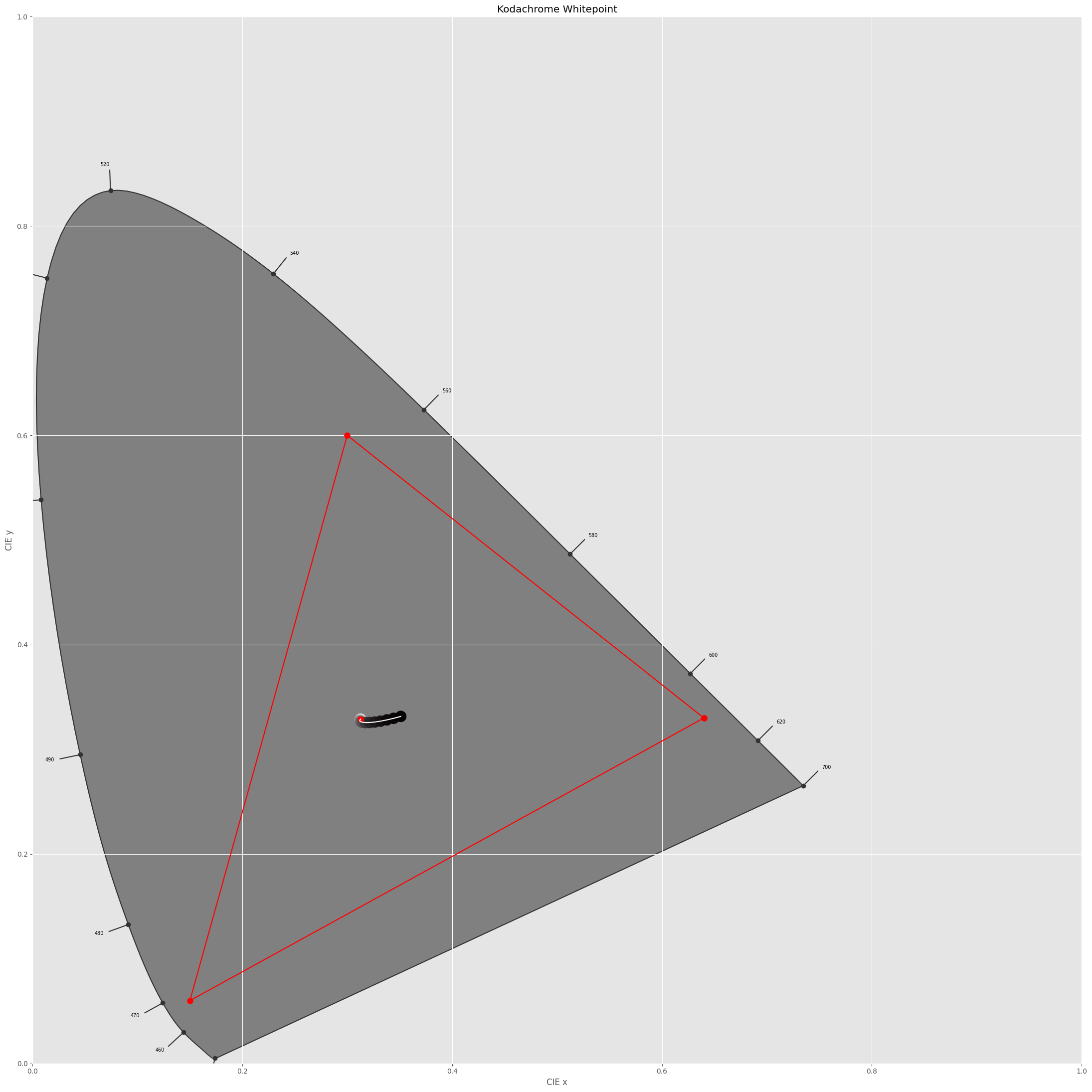
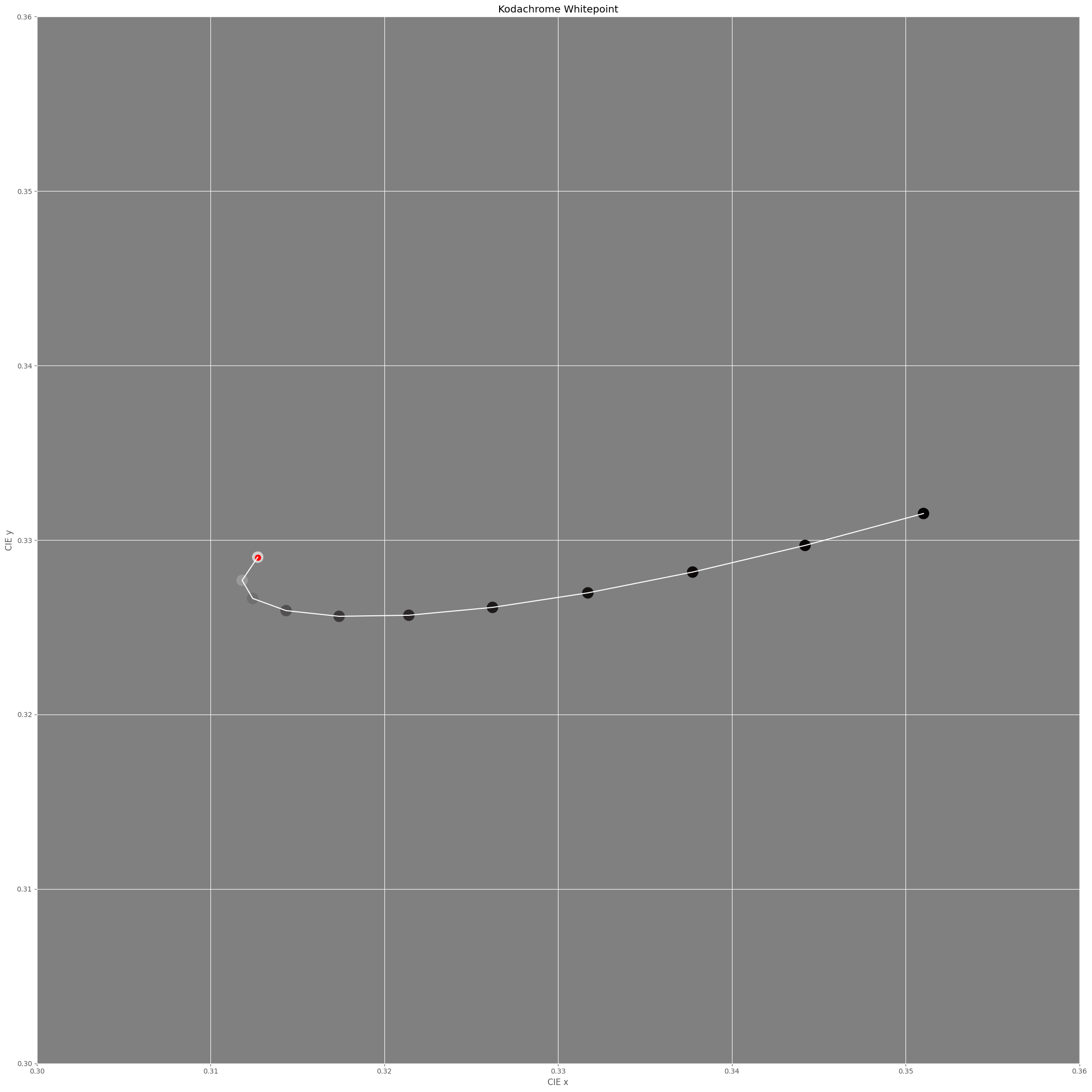
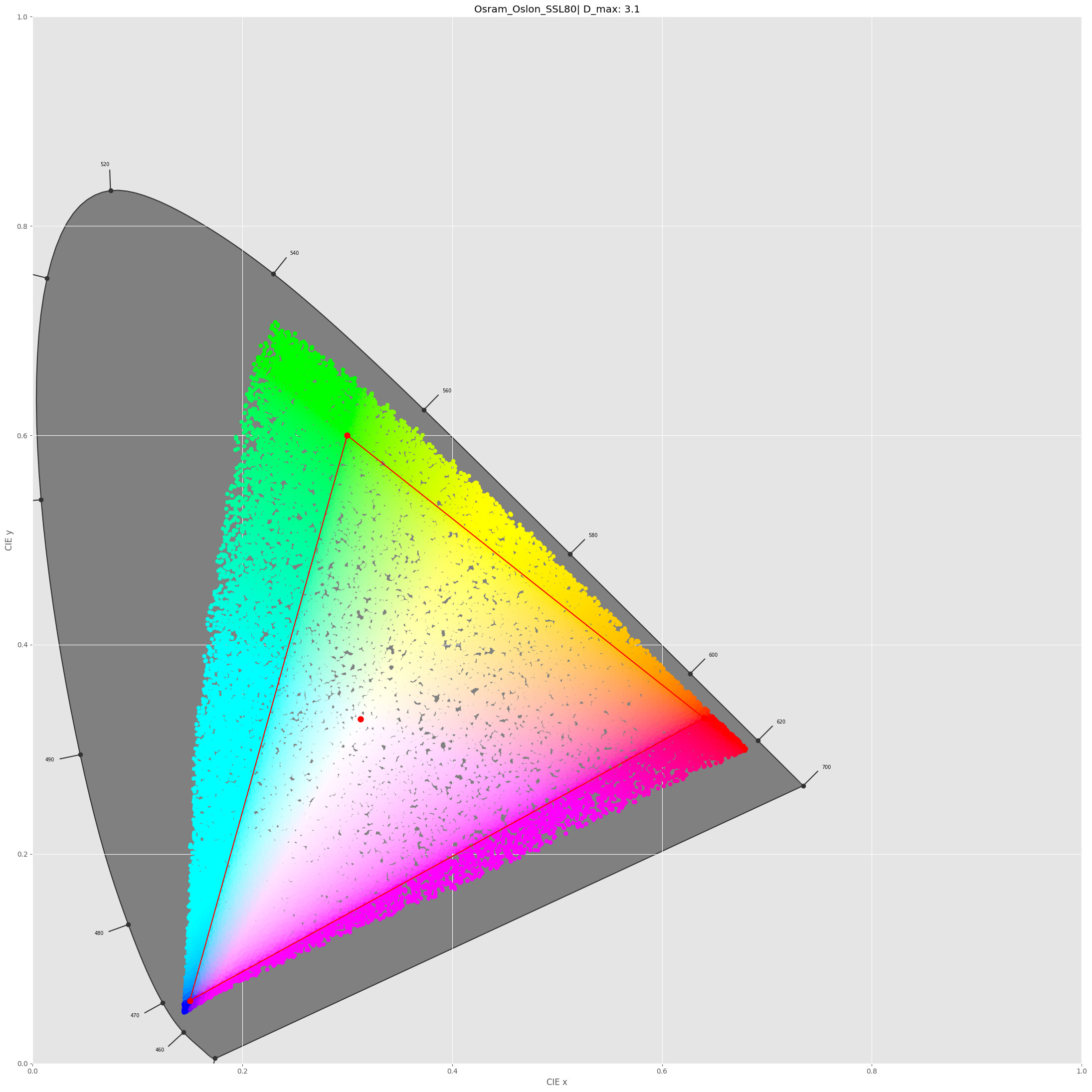
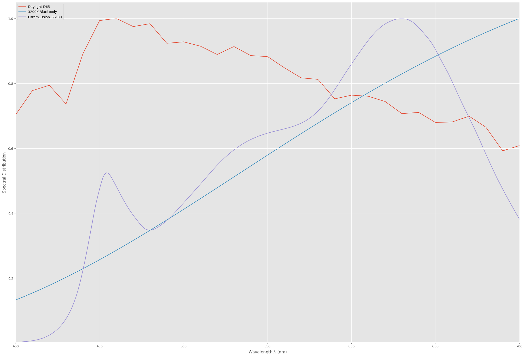
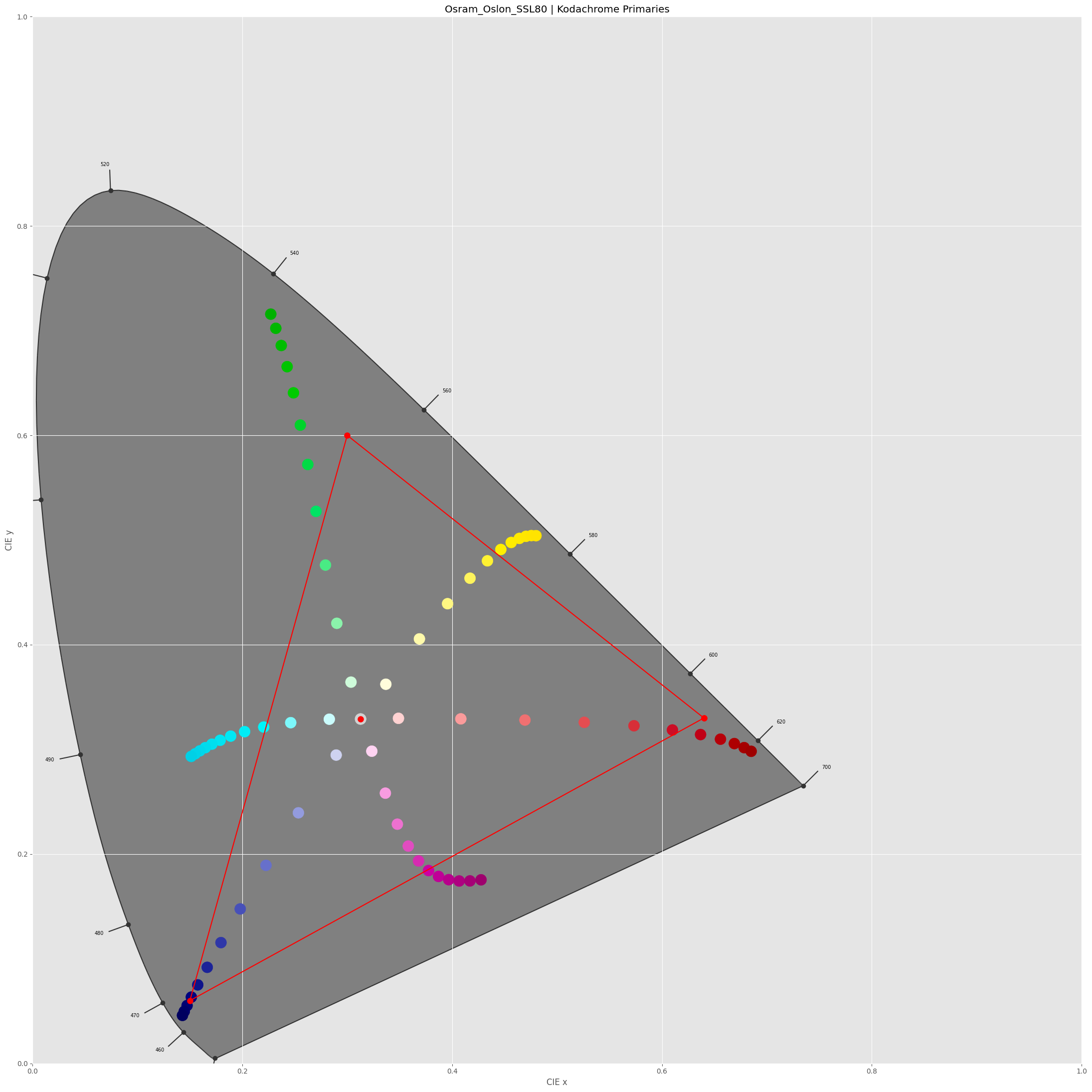
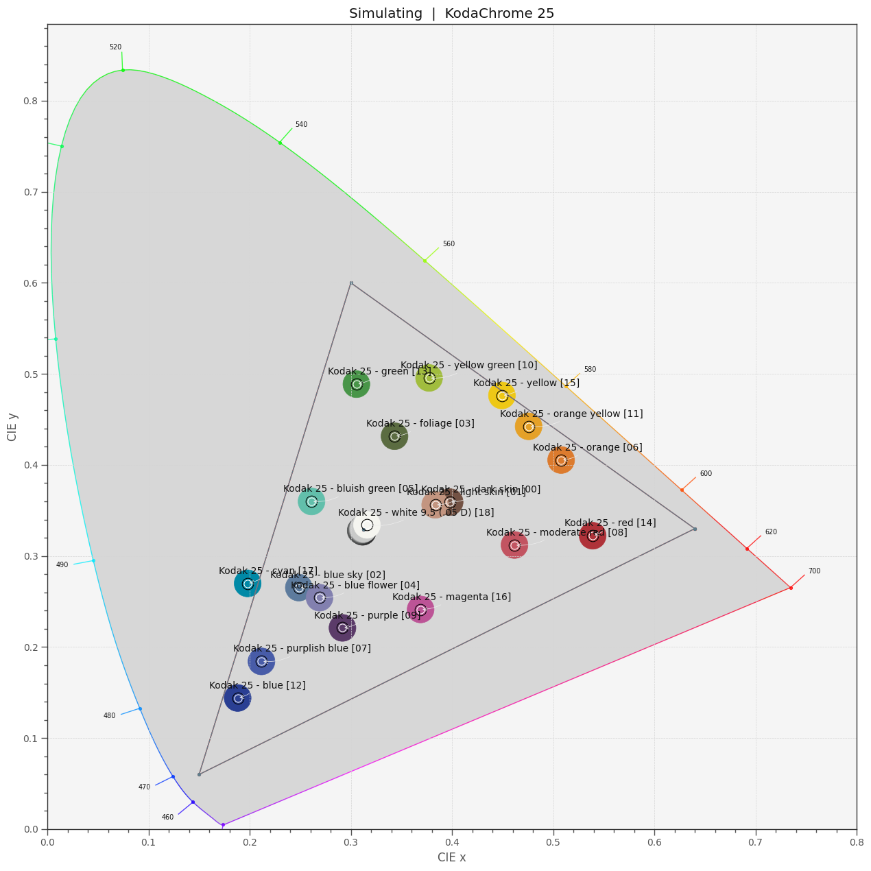
With this in place, I can check where the dye layers end up in a CIE-diagram. For this, I need to select a light source, I opted for my trusted Osram SSL80 whitelight LED:


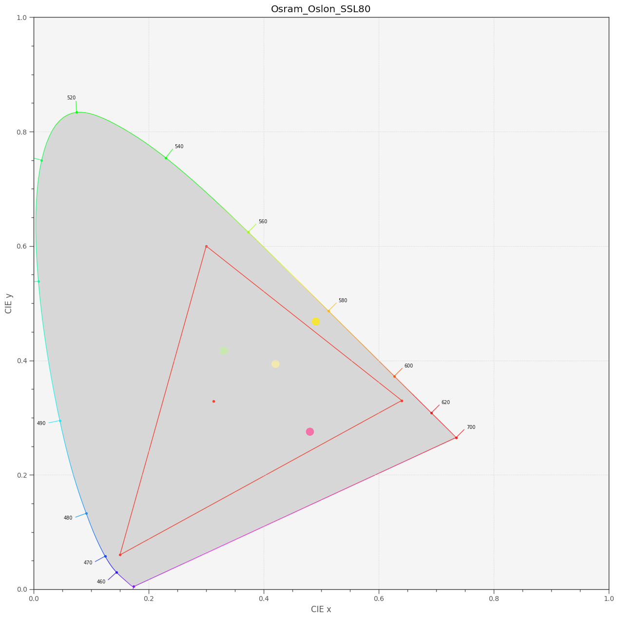
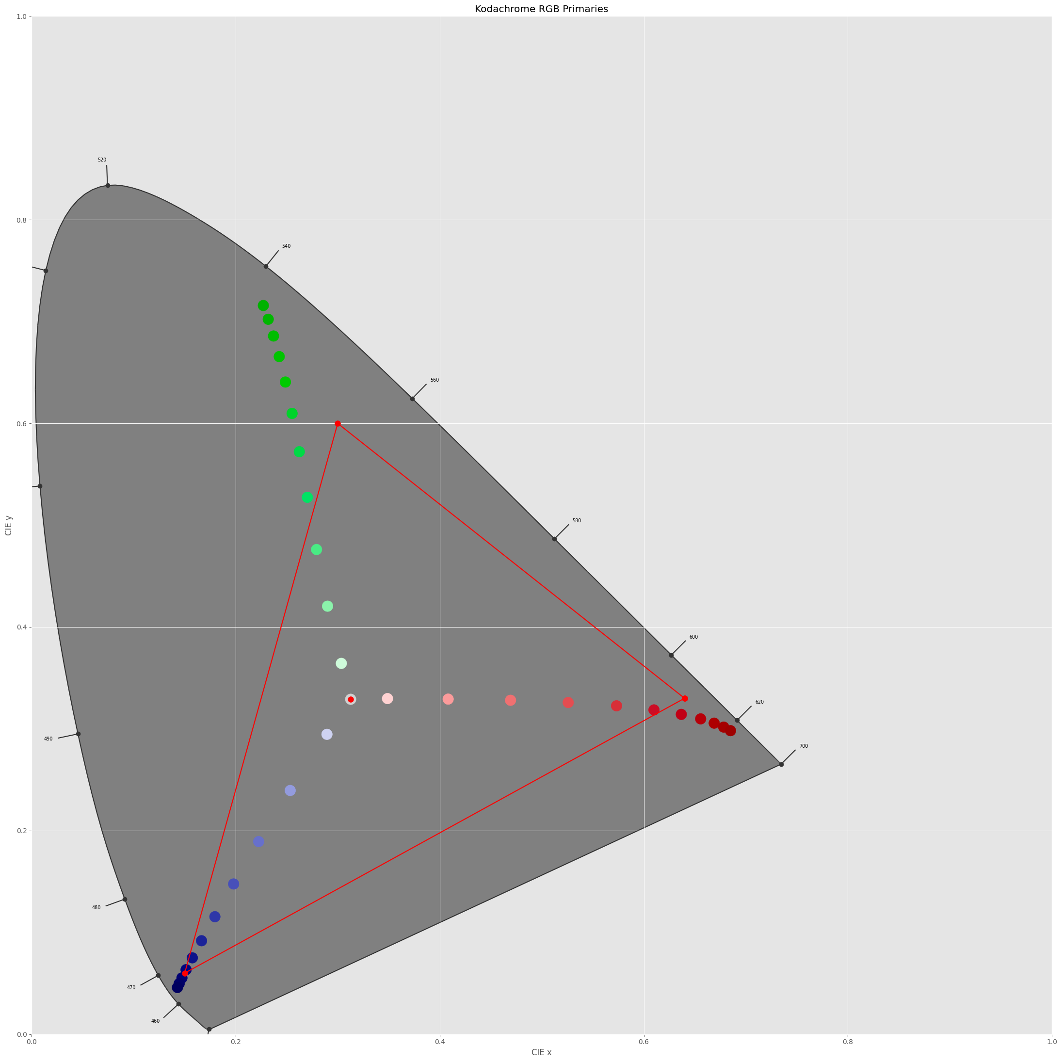
In the above diagram, the sRGB color gamut including its primaries is indicated by the red triangle. The yellow dye (yellow dot) is slightly out of the sRGB gamut, the two others (magenta and greenish dots) are within this color gamut. Of importance is the center dot - this is the position of the whitepoint - clearly, it’s off from the sRGB one (the small red center dot). So I guess I have to throw in a color space adaption transformation (CAT) here. I use the linear Bradford method (which is the same as recommended in the Adobe DNG-spec) and finally arrive at the following diagram:


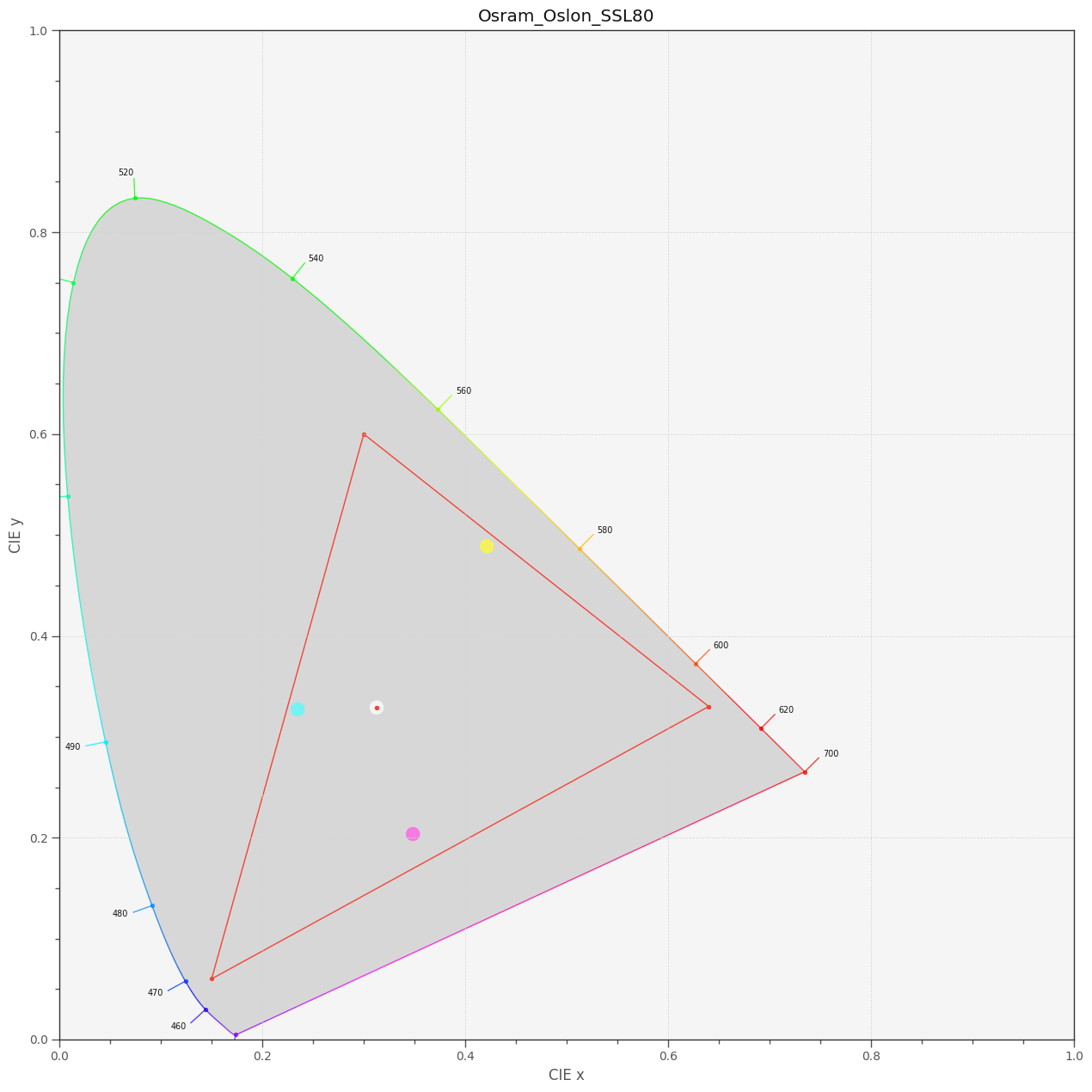
Well, the whitepoints do match now and all Kodachrome 25 primaries have moved into the sRGB space!

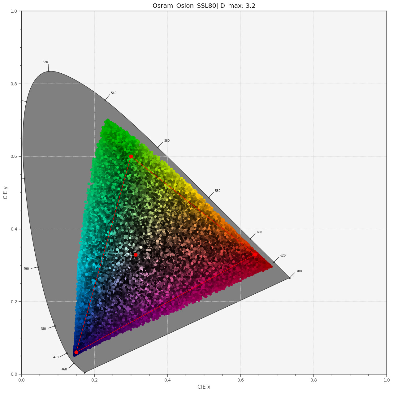
To get an idea of the total color gamut representable by the above dye spectra, I run a simulation of 50000 random combinations of the three dye spectra, basically picking random values for the scaleY, scaleM and scaleC amplitudes, keeping them in the range [0.0:1.0]. This is the result:


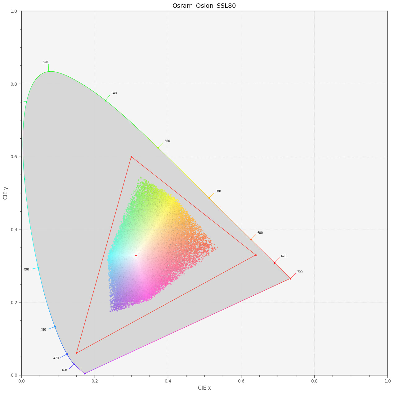
So it seems that all colors which are representable by a combination of Kodachrome 25 dye spectra easily fit into the sRGB color gamut. Frankly, I did not expect that.

I do not know whether my approach presented above is valid, but I do not see any obvious mistake. I take a virtual light source, pipe this light spectrum through yellow, magenta and cyan filter layers representing the dye layers and compute the resulting overall spectrum. This spectrum is converted into a XYZ color which in turn is mapped into the xy-diagrams above.

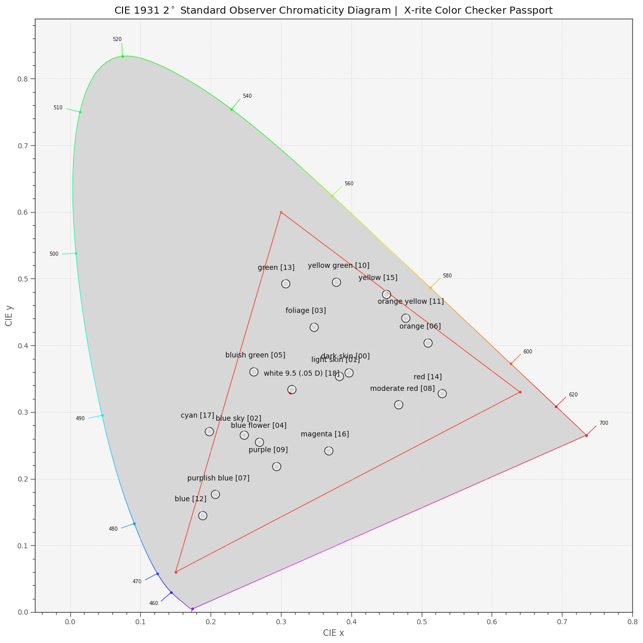
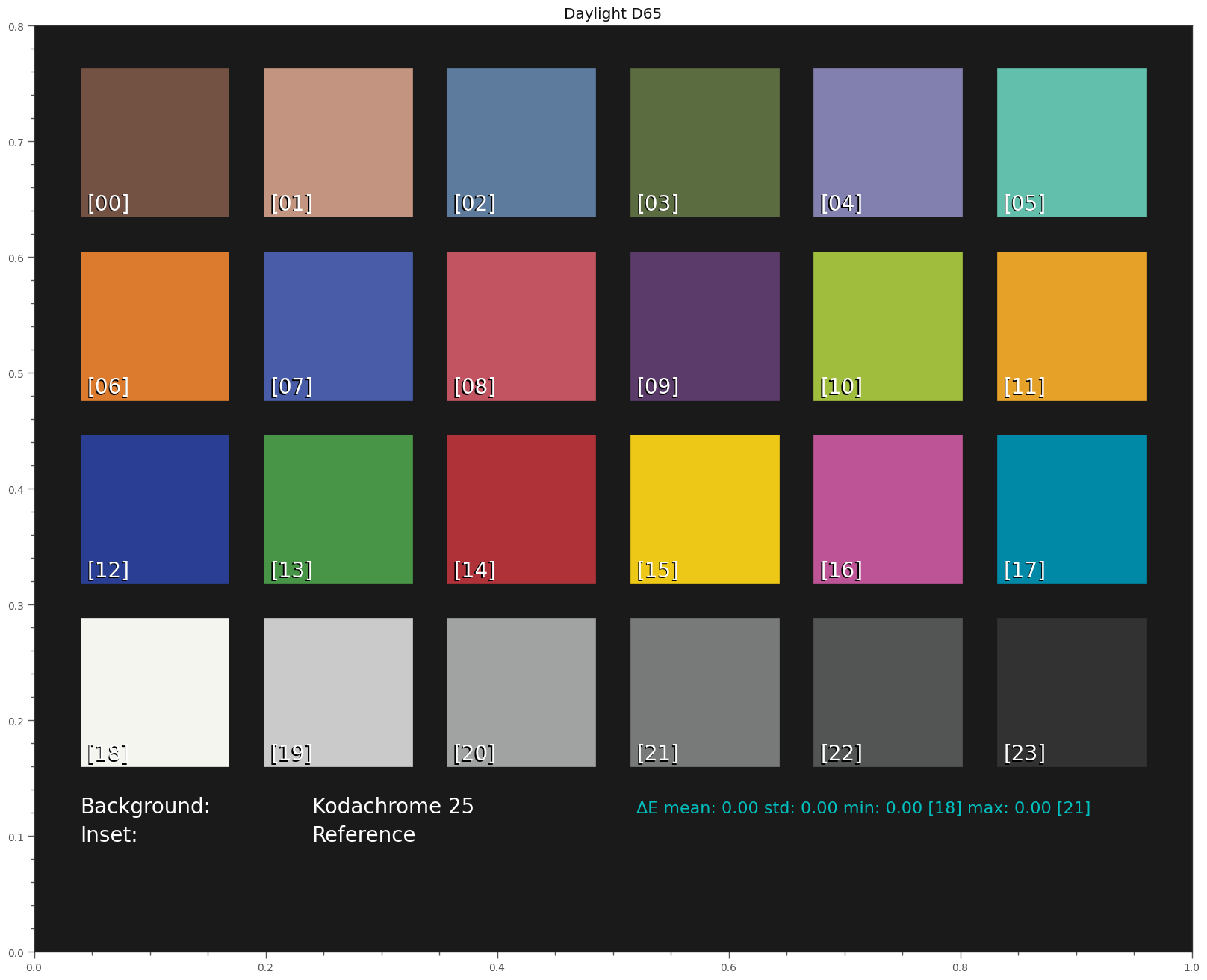
If this results is true, my actual project, namely creating a virtual Kodachrome 25 color checker, is not possible. Overlaying a standard color checker board,


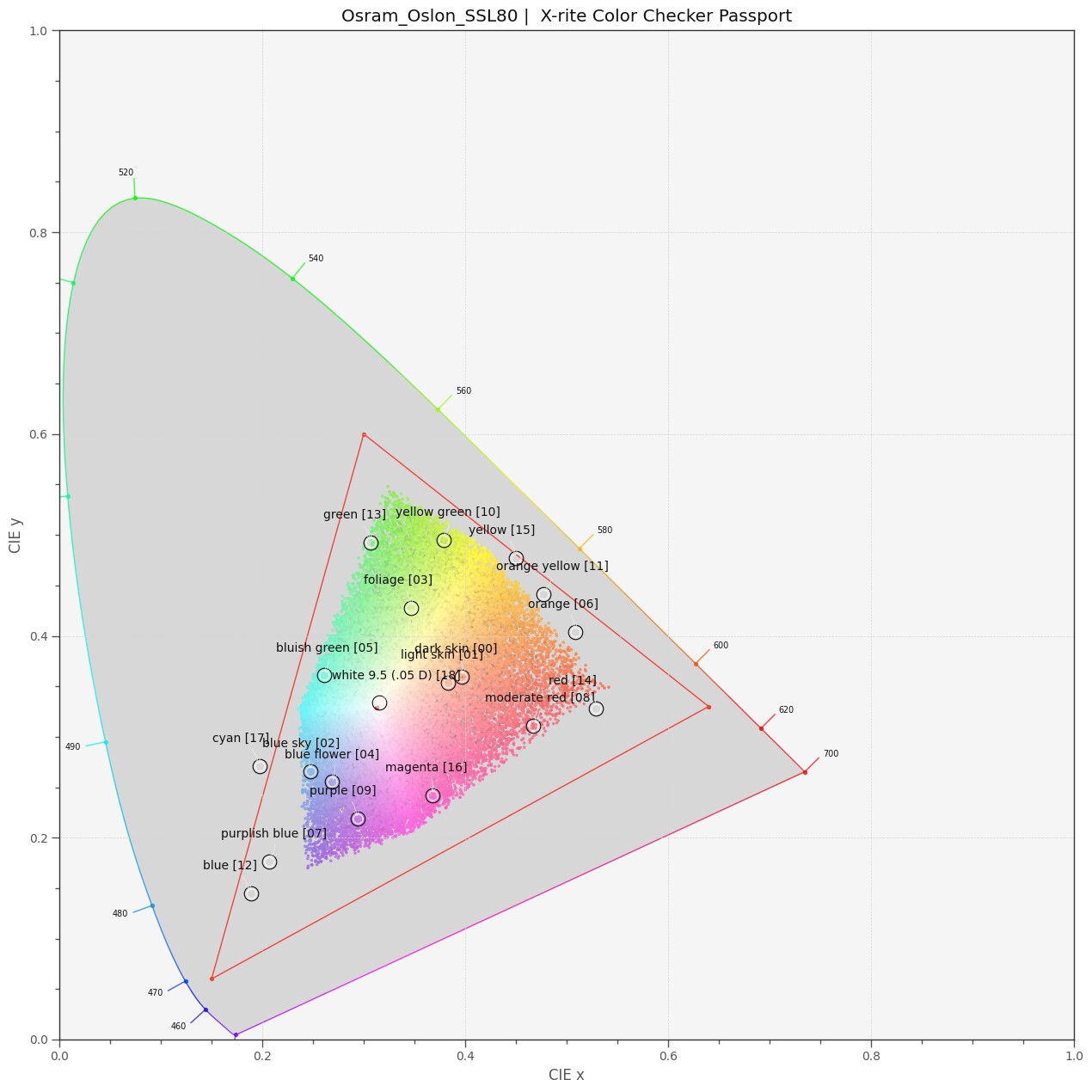
I can count 7 patches of the color checker for which a representation with Kodachrome 25 dyes seems impossible. These are mainly blue/cyan and yellow/orange/red colors. Note that the correlated color temperature (cct) of the SSL80 is 3212 K, which matches closely the illuminant of 3200 K cited in the Kodachrome 25 data sheet. The CRI of my (simulated) SSL80 is computed to be 97.286. A simluation with a real 3200 K blackbody radiator does not change the results.

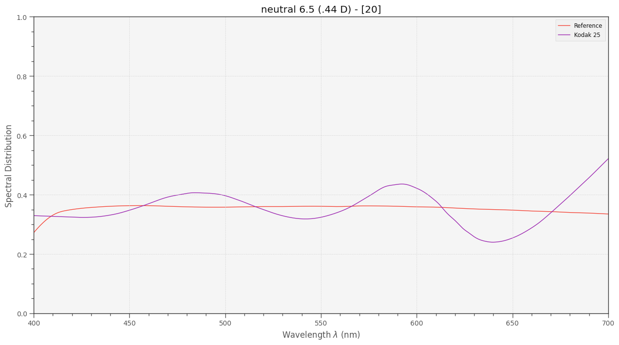
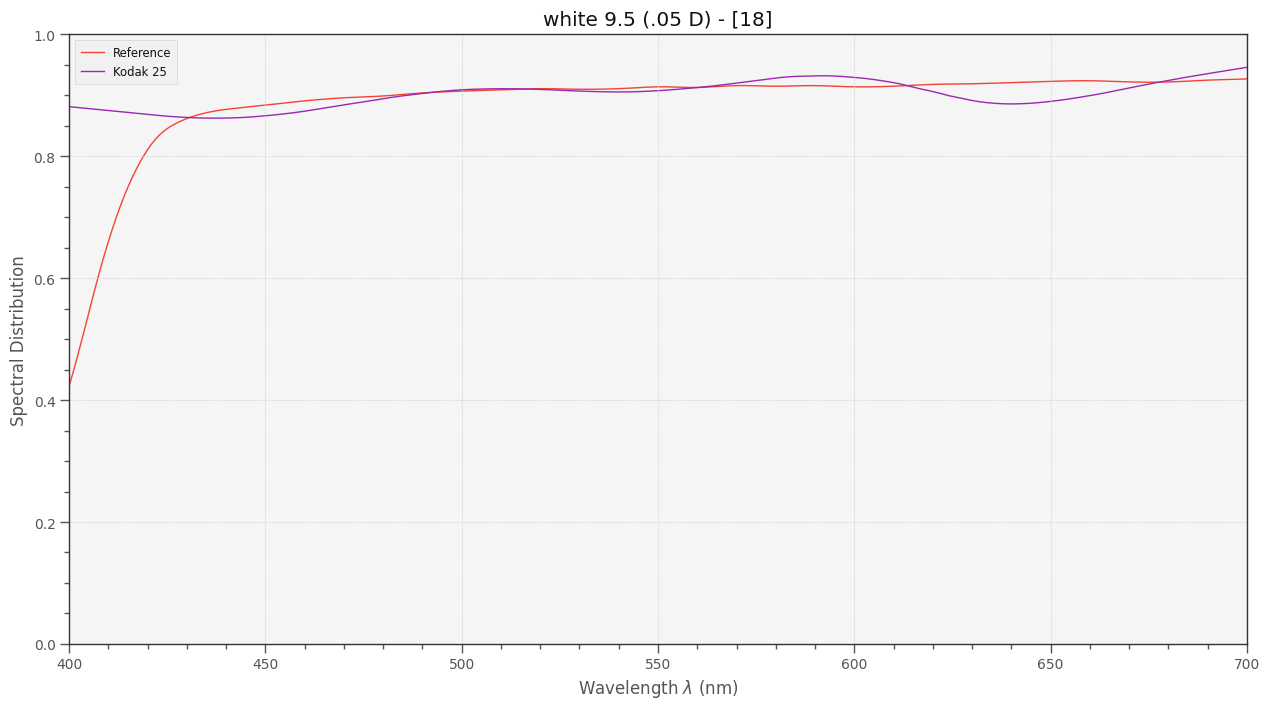
EDIT: I think I interpreted the original Kodachrome 25 data wrong. First, it is noteworthy that the SDs given are not normalized - overlooked that. Also, I need to take into account that these are densities which can vary more than just in the interval [0:1]. Lastly, the mentioning of a “illuminant of 3200 K” in the data needs further investigation. Normally, SDs are not dependent on the illumination source. Please refer to later posts in this thread for further aspects.

2 Likes

Thank you for sharing your research, interesting link.

If I understand the findings correctly, my interpretation would be that Kodachrome + LED is unable to reach some of the targets (actually LED or 3200K blackbody radiator).

My perspective -if I interpret the findings correctly- is that if a color checker was filmed on Kodachrome those 7 patches would not be in the intended locations, would be somewhat shifted/shrunk in the direction of the white center.

However, creating a synthetic target showing the shifted/shrunk resulting locations of these (within the Kodachrome gamut) would be quite helpful, as it would allow the use of the Resolve Color Match function to adjust to best fit, stretching the surrounding colors on the film patches to the digital gamut patches.

To do so, I guess it would be necessary to (proportionally?) decrease the vector of spots in the vector where the gamut is limited.

Akin to what I am doing empirically with the synthetic targets derived from raw values (I will share the process to reach the values of the RGB mixer later).

1 Like

Yep, so long as you can measure the XYZ colors (normally with a photo spectrometer but in the synthetic case you’re starting with those) across a representative sample of the gamut, you’ll have something quite useful.

I’m not sure how you teach Resolve about new color targets though. Is that an open/extensible format? The way that I do it with the IT8 target is to convert the resulting ICC (from Argyll) into a standard LUT file that Resolve knows how to use. It’s like doing the Color Match step outside of Resolve and just importing the final result. It amounts to the same thing: instead of a Color Match node you just stick a LUT node in the same place instead.

Or, when you suggested “proportionally”, did you mean to use the same/existing target choice in Resolve and just have it “stretch” the colors out farther to the original values in the target? You’d probably get something oversaturated, but if you did it right (proportionally, like you said), would it just be a matter of turning the saturation back down a little?

The later.
In real world, a color target will be shown within the kodachrome gamut (off the location expected). The purpose of the color match is to bring the representation of the targets to the digital gamut location.

In the synthetic world, the idea is to represent the vector of that color target where it would have been depicted in the kodachrome gamut, the Resolve color match function would then try to bring those to the corresponding location in the digital gamut.

1 Like

It’s kind of remarkable how little there is to find on the Internet when you search for discussion about the size of various film gamuts.

The only thing I was able to find with something that looks like real measurements was this page where the “Kodachrome Family” (not sure how that fits in with “25,” etc.) cannot be completely represented in sRGB. They found that only 91% of Kodachrome’s colors could be represented (with the other 9% falling out of gamut).

The “Color Set Evaluations” section at the bottom of the page has the table. KK is Kodachrome. I was surprised to see that Ektachrome (“KT” in the table) appears to have a wider gamut by virtue of it always having a smaller representable percentage of colors in every color space than Kodachrome’s.

1 Like

Yep. Just for reference, let me insert here a few bits of information I found while searching the internet for some further enlightment.

I found a better description of the spectral dye density data in one of Kodak’s other publications:

The spectral-dye-density curves indicate the total absorption by each color dye measured at a particular wavelength of light and the visual neutral density (at 1.0) of the combined layers measured at the same wavelengths.

Spectral-dye-density curves for reversal and print films represent dyes normalized to form a visual neutral density of 1.0 for a specified viewing and measuring illuminant. Films which are generally viewed by projection are measured with light having a color temperature of 5400K. Color masked films have a curve that represents typical dye densities for a mid-scale neutral subject.

So these curves are not what I initially assumed they are. Which solves my initial confusion prompting me to start this thread in the first place.

Second, in the scanning community, there seems to be some hype about Kodachrome slide scans coming out too blueish. In his “Reproduction of Colour” book RWG Hunt stated (p229):

When the viewing conditions consist of projection by tungsten light in a darkened room, the light form the projectors appears yellowish, and therefore to obtain results that appear grey the picture has to be slightly bluish; this is why the curves of Fig. 14.9(a)… are not even approximately coincident, the blue densities being lower than, and the red densities higher than, the green densities, in order to produce the bluish result required.

Here’s another find, from an old publication from ARRI comparing digital output devices (DLP and CRT) with classical film projection (EDIT: removed the links):

Motion picture print film has a wider gamut in the darker colors, especially in the blue and cyan hues. DLP and CRT monitor can produce more saturated bright colors in the red, green, and blue hues, but they cannot reproduce the yellow of print film, although the DLP does a better job than the CRT.

In essence, the authors state that you can never achieve with current digital display technology a display comparable to the projection of print film, at least in certain color ranges. Basically, this boils down to print film being a subtractive process, while digital display technology is based on additive color.

It would be great if other forum member can share/add additional information on Kodachrome or, generally, the difference between analog and digital media.

2 Likes

Those last two arri links seem to be behind some sort of authentication prompt. Do you know where/how to log in to read them? Even going to the subdomain root still makes the prompt appear.

That’s pretty cool engineering to have the film work in tandem with the light source (back when you could count on all users having the same color temperature), but it does throw a bit of a wrench into the gears. I suppose our to-taste white balance tweaking is a stand-in for pulling that wrench back out.

This also means simple response curves and 2D chromaticity diagrams aren’t enough to really simulate everything. If there was already scant data for this stuff, what do you suppose the chances are of getting our hands on a 3D gamut volume for Kodachrome? :grimacing:

Interesting. The results of the synthetic color target experiment are also blueish, which I had attributed to inaccuracies in the creation of the target, but according to the references, that is the correct color. Cool.

I am sorry - I have changed the above post. Was not aware that this is restricted material and did not check the links before posting. It’s been years (the document is from 2005) since I read that.

To summarize again what is discussed there: basically, there are quite large parts of the color gamut of print film which are hard to transcribe into a digital media format. The main reason is that film is a subtractive technology while digital media an additive one.

Which brings me to this:

Yep, has always been the case. In fact, Bruce Lindbloom has a nice animation for this.

Note that I am not doing in my simulations by basing them on “simple response curves and 2D chromaticity diagrams”. These simulations are usually carried out in spectral space, which is a function space (dim = infinite). Only where appropriate, XYZ coordinates are used (dim = 3). I am using chromaticity diagrams only for a quick and easy visualization; the input here is usually XYZ which is converted down to xy (dim = 2) for display purposes.

Using the full spectra data is mandatory to capture illumination specifics as well as modelling metamers correctly, for starters. As soon as you have condensed down the wild variation possible in any spectra to a few numbers (dim = 3 to 12), with 3 corresponding to classical RGB sensors and 12 to many multi-spectral cameras, you loose some precision.

Well, if the SD-curves cited above from the Kodak data sheet are somewhat close to the real curves of the material, the 3D gamut volume of Kodachrome can be calculated. Basically in the same way as I did above. Only with the correct input.

My problem is that my trivial interpretation of the data (being simple absorption SDs from which I can derive the transmission spectrum as described above) is obviously not valid. I probably have to throw in some log-transformation to get from the absorption SDs to transmittance data. Something like I_out(lamba) = I_in(lambda) * 10**(-A(lambda)). Will check this as next step. If that does not work out correctly, I have to attend the “for a viewing illuminant of 3200 K” remark in the above diagram. That could indicate that the spectra are not referenced to standard illuminant E but to something like D32. If so, I would need to rescale the data curves from the data sheet. I guess that’s at least the plan for the next days/weeks. It might not work out, we will see.

1 Like

… picking up this thread again. Remember, the topic is the color gamut of Kodachrome 25 film stock.

Initially, I was way too simple-minded when doing these computations. In fact, I actually started this thread in the hope to find more information on this diagram:


and how to interprete this data. I continued in parallel my journey through the internet to find out more about these data sheets - that turned up practially nothing until today.

So… - I came up with my own interpretation of the Kodak datasheets. And, as the characteristics obtained do not look too weird, I want to report here at what I arrived until now.

First, I decided to ignore the “for a viewing illuminant of 3200 K” comment on the graph. The “Visual Neutral” curve of the graph is a close approximation of the spectrum one would obtain with a grey card and with illuminant E. Which would be just a constant horizontal line. The “Visual Neutral” is a little bit wavy, but resonably horizontal oriented.

Next is the observation that the y-axis is called “Diffuse Spectral Density” - so these might not be absorption spectra at all. Assuming instead that these are really densities, one would have

absorption = 10**( -density(lambda) )

as a formula for the absorption of a single layer of film. Of course, we have three of them.

The next question to answer is the variation range of the dye densities. Well, this data is not given in the Kodachrome 25 data sheet. I made the following shortcut: there is a density diagram in the data sheet, but only for RGB data:


I digitized the curves at the red dot positions and obtained:

D_min   = 0.193

D_max_R = 3.676
D_max_G = 3.446
D_max_B = 3.319

D_max_R_lin = 2.900
D_max_G_lin = 3.082
D_max_B_lin = 3.304

Here, D_min is the density of the film base (the rightmost dot in the diagram), and the D_max values are the maximal densities possible (the three leftmost dots). The D_max..._lin value are the three dots at the end of the linear part of the curves.

Tactically, I opted as density range for the dyes, [D_min:D_max], with D_max given by

D_max = (D_max_R_lin+D_max_G_lin+D_max_B_lin)/3 = 3.095

With the above absorption formula, this gives me for the whole range of densities a transmission value for each wavelenght. For example, the yellow dye yields the following transmission graph:


Note that here the difference between the yellow and blue part of the spectrum is getting stronger for larger densities (darker colors). So already here we see a characteristic of the subtractive nature of classical film: darker colors appear more saturated. That looks promising…

Next, let us look at the whitepoint of Kodachrome. That is, the “Visual Neutral” curve from above. When viewed with a normal projection lamp (around 3200 K), “white” will be somewhat yellowish. However, the visual system of the observer will take care about this, via a color adaption transform. I opted not to use a projection lamp for the simulation, but again my Osram SSL LED as illumination source. The differences are neglegible. Let’s have a look on how the “Visual Neutral” with varying densities behaves. For this, we are utilzing a classical CIE-diagram, operating in sRGB for display purposes:


A short regression is in order here: this diagram displays the chromaticity of all colors a human observer is able to perceive. The red triangle marks the boundary of colors which can be displayed correctly on the chosen color space, in this case sRGB. Colors outside the red triangle are only approximations of the real color. The red center dot marks the whitepoint of the color space.

Now, there are basically no colors displayed here. That is actually to be expected, as we are mapping "Visual Neutral"s, that is “whites”, into this diagram. Let’s zoom into the center part of this diagram:


The red dot marks the whitepoint of our display color space, and as we can see, a lot of the brighter data points land directly where they should land. But, looking toward darker intensities, we observe a drift (mainly towards the yellow) of the Kodachrome whitepoint. Since shadows usually have a tendency to be more blueish anyway, that is actually probably not too bad.

Let’s check how our film dye layers (Magenta, Cyan and Yellow) perform. Varying the density of the dye layers from [0:D_max], where D_max is given by 3.095, we obtain the following diagram:


Remember, the colors outside the red triangle are only approximations to the real colors, as they are outside of our display color space. Clearly, the dye colors go outside this range for higher dye densities. Note that the primaries do not move on straight lines, as it would be the case for an additive device (your computer screen, basically, or your digital camera).

Ok, onto the red, green and blue colors. The computations yield the following:


Especially in the green part of the color space, the Kodachrome colors end up way outside the sRGB color gamut. To get a better impression of the size of the Kodachrome 25 color gamut, I created 50.000 random colors and mapped them all into the CIE-diagram. This is what I obtained:

That in fact looks more correct than my initial simulation based on a wrong approach. And quite similar to the only Kodak CIE-diagram I could find (the right plot below):


(This is from an old Kodak-publication, “Exploring the Color Image”.)

So: the color space of Kodachrome 25 film stock is greater than the sRGB display space. At least if my interpretation of Kodak’s data sheet and my simulations are reasonably correct.

One final note: the size of the color space depends mainly on the density range. I used a rather large range in the above simulations. If I constrain the density range sampled for the test to only [D_min = 0.5: D_max = 2.5] (positioning the test colors more on the linear part of the density curves), the color space shrinks a tiny bit:

That’s if for now. The whole exercise above should allow me to create a virtual Kodachrome 25 color checker chart - which in turn should allow me to compare scanning quality with whitelight LEDs vs discrete narrowband LEDs - that’s the next step here. Again, the above simulations are based on a lot of guesswork - so any comment is highly appreciated.

2 Likes

Thank you for sharing your thought process and results, very informative.

A noticeable difference between the gamut depicted in the simulation and in the kodak citation is the side of the triangle from red to blue. Reds are particularly intense in Kodachrome.

Would using the Osram LED vs a 3200K may be the cause for the gamut shift upward (greenward) ?

This looks like great work. Thanks for digging into all of these small details. I love that density-based transmission graph for the yellow dye!

Would the “91.29%” result from the Lindbloom site help with any double-checking here? Of your 50,000 random points, can you calculate an in-gamut percentage and see how closely it matches their measured-from-a-real-target datapoint? That might help inform the results of additional experiments.

If these virtual results landed close to their measured results, that would be another indicator that the math was on the right track.

Well, the bulb used in normal S8 projectors comes rather close spectralwise to a Blackbody radiator of 3200 K. And the difference to the SSL80 LED is rather minor. See for yourself:


For comparision, I have included the D65 spectra (which is the whitepoint of sRGB-displays, for example).

The small differences between the SSL80 and Blackbody spectra has it’s influence on the result. But in my simulations they are so small that they would be covered by other variations and inaccuracies inherent in my simulation. But, see for yourself. Here’s the color variation of the film dyes (magenta, cyan and yellow) and the corresponding RGB primaries computed with the SSL80 illumination:


Here’s the result of the same simulation, only that the light source has been swapped to a Blackbody radiator of 3200 K:

I can spot the differences only when I flip fast between the two graphs. Basically, they are identical. Again, there are a lot of inaccuracies inherent in my simulation (for starters, I used as CAT “Linear Bradford”, which does not exactly model the reaction of the visual system of a human observer watching a projection screen in a dark room).

Yep, here’s a noticable difference between simulation and Kodak graph. But Kodak did not mention what type of film stock was used to generate that gamut. At the time of this publication, Kodachrome was already being phased out for newer technology, so chances are that this gamut does not reflect data from Kodachrome. It might not even be the gamut of a reversal film stock but a print film.

Interesting is actually the comparison of the left graph (“highest excitation purity” of glossy Munsell samples) with the film gamuts. Seems that the colors of real color samples are well contained in the color range of film stock

Yes, Kodachrome has a certain hype and discussions about the film characteristics (and the difficulties of scanning Kodachrome vs other film stock) are many. But note that I simulated here only the available color range of Kodachrome 25, given the spectral characteristics of the film dyes (assuming that my assumptions about doing this are correct).

For a simulation on how, for example, colors of a flower would look like, there is much more to do:

  1. Get the reflection spectrum of the flower.
  2. Get the spectral power distribution of the illumination.
  3. Get the spectral transmission of the lens used.
  4. Combine all data from 1.-3. into a power spectrum reaching the film.
  5. Fold the “Spectral-Sensitvity Curves” from the data sheet with the spectrum obtained in 4 to compute the exposure value for the magenta, cyan and yellow forming layers (a note at that point: in reality, a single dye layer is usually composed of several layers with different grain sizes - the larger ones are more sensitive, the smaller ones only get exposed in bright image areas.).
  6. Use the “Characteristic Curves” data to get from an exposure value to a density for each dye layer. At that point of the processing chain, we have arrived at the density variations for each dye layer for the given scene. We have taken into account the scene itself (points 1.,2. and 3, above) and the film development process (points 5. and 6.). In other words: our color-reversal film frame is defined at this point, in terms of the varying dye densities. Or in other words: for each pixel of the scene, there have been three density values computed which encode the chromaticity and brightness of that pixel.
  7. Taking the film frame defined in the previous step as starting point, it is now time to select a projection lamp. For S8-amateur film, this was usually a bulb with a spectrum very close to a Blackbody radiator of 3200 K.
  8. Take for each dye the spectral density and compute from this a transmission spectrum for each dye.
  9. Neglecting that the projector’s optics as well as the silver screen the image is projected onto have a spectral characteristic varying over the wavelengths, we can compute the spectral power distribution on the screen by folding the lamp’s spectrum with the three transmission spectra of the dye layers.
  10. Next step is the simulation on how a human observer would perceive the spectrum computed in step 9. To be precise here, one would need to take the viewing situation into account (a mostly dark room with a bright projection screen). I simplified this step doing only a color adaption based on the linear Bradford method.
  11. The previous step will yield a set of three numbers in XYZ-space - which is a perceptional space. For the purposes of researching the color gamut, the CIE-diagram is usually used. In these diagrams, only the chromaticity (xy) of the computed XYZ is displayed. The luminance is ignored.

So - the simulations reported here cover only steps 7. to 11. Which tells us nothing about the films color rendering abilities. The whole process from object colors to dye densities (steps 1. to 6.) have not been modelled. While that would certainly be interesting, I’m actually looking for lower-hanging fruit. As a next step, I want to figure out the color spectrums of the Kodachrome 25 film stock that produce the same color to a human viewer as a color proof pad. That spectrum will be different from the spectrum of the color patch itself. The former is the result of Kodachrome’s dyes, the latter the result of carefully combining inks to produce a specific color perception. In a further step, I want to exchange the human viewer with the HQ camera and the projection lamp with different LED-setups. Specifically broadband whitelight LEDs vs differently placed narrowband red, green and blue LEDs. Checking of course the color fidelity of the different setups. Maybe arriving at some insights on what scanner illumination is preferable for our goal of digitizing S8-film stock.

1 Like

Lindebloom is basing his estimates on “IT8 data reference files produced by the film manufacturers” as far as I understand this. Up till now, I did not find any data for Kodachrome 25. Besides, at the moment I have no idea how knowledge based on IT8 targets can be used to find out the maximal color gamut of a device. Given, the cyan patch of most standard color checkers is outside of the sRGB gamut. See here:


But it’s the only patch outside of sRGB. All other color patches are well within the sRGB space (the red triangle in the above graph). In an sRGB system, you would not notice any color space boundary, except for the cyan patch. And that only if you look very closely.

But, I must confess that I am not too familiar with IT8, so I might overlook here something.

Well, I think that will not work. For the creation of the graphs, I am sampling with an equal distribution in density space. That results in a very uneven distribution of sampling points in XYZ color space.

As I am currently only be interested in the borders of the color gamut, that uneven sampling is ok, given a sufficient large number of samples. But it does not yield an even distribution in XYZ-space. If I create the above full color gamut graph with including the actual brightness of the data points, I get this:


Note again that any color outside of the red triangle is not correctly displayed (it’s only an approximation). Notice the uneven distribution of brightness values in the above plot?

On the other hand, if we argue more philosophically for fun and for the rest of this post: the quest for larger color spaces is not always driven by real needs. For starters, most real-world scenes will have difficulties to feature even some spots where the saturation reaches such high levels that a larger color space would be required. Have a look at the left diagram of this old Kodak plot:


This is the color range of a set of “glossy Munsell samples” having the “highest excitation purity for a given hue”. Actually, most of that space is already covered by the humble sRGB space.

Given, in current times, audiences are used to very intense colors from their mobile phones, and are expecting a certain “punch” from an image. So in terms of output color spaces, the larger is certainly the better.

From my experience, color spaces digital cameras are operating in are much larger than the color spaces normal displays can achieve. So a major step in any color grading process is the adjustment of what a camera delivers (large) to what the user’s display can reproduce (small). There’s a huge body of research availble here with different strategies. In practice, it probably boils down to an artistic decision, depending on scene content and intention. Most of the time, such adjustments are done manually, but even DaVinci’s color space transformation module offers different automatic possibilities.

With respect to our goal, digitizing old film stock, I am rather certain that most digital cameras are usable for this task, mostly. To give a number: the average maximal density of Kodachrome 25 from the data sheet is given by D_max = 3.48. That is equivalent to about 11.6 stops and requires therefore a camera which is able to deliver a good 12 bit dynamic range - which the Raspberry Pi HQ camera is barely able to achieve, and this only in certain modes. Since Kodachrome does not fade too much in the dark (but careful: it fades much stronger under projection illumination than for example Ektachrome!), the HQ camera is a sensible choice for Kodachrome, especially considering the price and the well-defined color science (it’s open software, after all). I am not so sure about the quality of the color science with scanners based on “color” machine vision cameras.

Speaking of color science: for me, it’s still an unresolved question whether I would strive for maximal color separation in a scan vs faithful color reproduction. Both of these concepts are contradictory. For example, the color patches 00 and 01 of a color checker (see above) simulating skin colors are closely spaced together in the CIE-diagram. Increasing color separation would move them apart, off their ideal positions. At least for unfaded film, I think I would stick to the goal of matching the colors of the color checker (what you did with the calibration of your monochrome camera) rather than trying to achieve maximal color separation.

Switching the topic now to faded material. Here, the question surfaces what is better: a larger color space or a smaller one. In fact, a larger color space is not always the better one. This has to do with the digital representation of the data. It might be 8bit integer (jpegs for example), it might be 10 bit integer (some modes of the HQ camera), or 14 bit (most DSLRs). Or it might be 32bit float (DaVinci). However, even the 32 bit float representation of DaVinci is a discrete representation. That is, color and intensity values are only possible at a finite set of values. That fact shows up occationally in banding of sky areas when processing 8 bit jpegs.

Banding issues will usually not crop up within the context of 32 bit float processing - which is the default in DaVinci. Whatever color space is used. But the larger color spaces have obviously a coarser representation grid than the smaller ones. So if you do not need the larger color space, it’s probably worth using a smaller color space, covering your data with a finer representation. The risk of banding will be reduced. Whether this consideration really matters in practice - I do not think so.

(A side note: be aware that LUTs are the hidden devil in DaVinci color processing. Because for the computation of LUT-transforms, the actual 32 bit color value is converted to a 16 bit integer representation, the LUT-lookup is performed and the resulting data is converted back to the internal 32 bit representation. So with a LUT, you siliently loosing color precision. Not a big deal usually, as LUTs are generally used at the start or end of a processing node graph, where we anyway sample up/condense down to 8 to 16 bit formats. But you are better off doing a color space transformation with a color space transformation node (32 bit float) than doing it via a LUT (16 bit integer). Given, noone will notice the difference visually…)

Now, when we are processing faded film stock, we are exactly in the situation where one or two of the color channels operate in a limited range only. That range would be better represented (sampled) by a smaller color gamut. A bit counterintuitive, right?

The major challenge is anyway not in the post processing path, but in the camera aquisition step. An HQ camera with a maximum dynamic range of 12 bits (in reality actually more about 10+ bits) won’t shine here. In fact, your approach (three separate exposures through filters) could be beneficial here by adjusting each exposure to the dynamic range of each dye. Of course, the necessary setup and post-processing would be more complex and the results might not improve enough to make the effort worth it…

The approach I have demonstrated with white LED separately capturing each raw color, using a different illumination setting to obtain the best range could also be beneficial.

1 Like

Absolutely! Such an approach might improve the data in case of severely faded material. I am not sure if such additional efforts are necessary for unfaded material. I guess only experiments and experience will help here.

1 Like

… continueing my exploration into Kodachrome 25 film stock. After I obtained (with my interpretation of the data sheet) some sort of a sensible color gamut, my next topic is the estimation of film dye densities corresponding to a given color value and the resulting film transmission spectra. Once I have that tool, I want to subject the virtual Kodachrome 25 film to various different illumination sources, hoping to gain some insights into how film and illumination interact in film scanners. Here’s the results of trying to create a virtual Kodachrome color checker.

To recap: the color gamut of Kodachrome 25 turned out to be large enough to cover sRGB and some more. Repeating here a previous graph,


one sees that the range of the film dyes (magenta, cyan and yellow) as well as the RGB-primaries composed from dye combinations (red, green and blue) easily cover the sRGB space (the red triangle). However, as one can see from the curved nature of the dye’s curves, it’s a non-linear relationship between a certain RGB-value and the corresponding film dye densities.

So the next question to answer is: can the three Kodakchrome dyes (transmissive) create the same color impression to a human observer as, say, a standard color checker (reflective) viewed under the same illumination? That is, can I create a virtual color checker board simulating a standard color checker (printed with special dyes) like the X-Rite brands, for example?

For this to test, I took the spectral distributions available for a standard color checker (specifically the BabelColor Average data of the colour python package), selected as illumination source D65 and computed from that data the XYZ-values of each of the 24 patches of a standard color checker.

Once that was achieved, I employed an optimization scheme (Levenberg-Marquardt) to compute for each color checker patch a set of three film dye densities which yield the same color to a human observer as the printed color checker patch. That actually worked quite well. Here’s the comparision between the printed color checker (solid colored disks) and the computed virtual Kodachrome 25 film-based color checker (the black/white circles superimposed):


Note that traditionally, the cyan patch, 17, always ends up outside the sRGB gamut. So in my next diagram (which shows the colors of both color checkers), all colors are displayed correctly, besides patch 17:

If there would be a difference between the color checkers, one would notice a difference between the center and the surrounding edge of each patch. Clearly, there’s non, which is also indicated by the computed ΔE between the two color checker. It is zero to the numerical precision used here.

So it seems that I have my virtual Kodachrome 25 color checker board for further investigations!

It is interesting to check the computed data a little bit. For example, the yellow patch 15 is actually located rather close, colourwise, to the yellow dye’s color. However, the densities computed (magenta, cyan, yellow) are as

yellow densities = [ 0.17177264 0.10018189 1.71951536]]

So while the yellow component is strong, the others are non-zero - that is most probably related to the color of the patch being a little bit dimmer than full brightness.

Even more interesting is the comparision between the spectra of the reflective color checker (our reference) and the simulated transmissive one (the simulated Kodakchrome 25 film). Here are the spectral distributions of both for color checker’s yellow patch 15:

They are close, but not identical.

Of course, they cannot be identical, because the reference achieves its spectrum by a larger set of carefully chosen print dyes whereas the Kodachrome film simulation can only combine three fixed film dye spectra to match the reference.

In any case, both spectra yield the same color impression for a human observer. What we are seeing here is a case of metamerism: with only three color channels, the human visual system cannot differentiate between slightly different spectra.

Looking at other patches, the difference is a little bit more pronounced. Here are the spectra of the ‘foliage’ patch (03):


While both spectra look kind of different, the color impressions are the same!

Also interesting is the spectral comparision for one of the grey patches. Specifically, here’s the data of the ‘neutral 6.5 (.44D)’-patch (20):


Again, the spectal curves look very different.

Ideally, each spectrum of a grey patch would be a simple, constant horizontal line (that’s what defines ‘grey’). While the printed color checker achieves quite a good approximation to this (by combining a larger set of print dyes), the simulated Kodechrome color checker is constraint to achieve this with the given film dye’s spectra, that is, by combining only three dyes. Which results in a somewhat wavy overall spectra.

In fact, if we compare this result to the ‘Visual Neutral’-curve in Kodak’s data sheet:


we notice that Kodak’s ‘Visual Neutral’ displays a rather similar waviness.

I think already here the ghost of narrowband LED scanning raises its head. Imagine a red channel LED located at 640 nm. Scanning the Kodachrome grey patch 20 with such an LED would result in a quite small amplitude in the red data channel - whereas one would usually expect to have an amplitude similar to the other channels (blue/green), for a grey patch. So tiny color shifts might be introduced by narrowband scanning - whether this is true and whether this is will be noticable is the next step I want to explore.

2 Likes

The typical scanner operator would compensate by increasing the Red intensity to achieve white-balance, effectively unbalancing the capture.

Well, I expect that such an action might throw off the balance for other patches. For example, the dip @ 640 nm is not so deep in the ‘white 9.5 (0.05 D)’-patch (18) spectrum:

Compare that dip with the patch 20 dip plotted above. You can either adjust for the .44 D or the 0.05 D patch, but not both.

Given, that slight variation of the color balance (in this case related to different levels of grey) might not be noticable at all - I do not know at the moment. That’s actually what I want to find out: what is the risk associated with narrowband scanning (trying to achieve something like “maximal color separation”) vs broadband scanning (simulating in a way the broadly tuned visual system of human observers). For general reflective spectra (printed color checkers), I think I already showed here that using narrowband illumination is not so good in terms of color fidelity. My current adventure is to check whether the same holds for transmissive spectra constrained to be composed from only three components (the three film dyes). I expect that the broad dye spectra help here with narrowband scanning. Will be interesting to compare different scanning setups. That is: broad- vs narrowband illumination, optimized camera matrices vs scientific tuning file matrices, etc. But that will take a while until this is implemented…

2 Likes

That’s a lot of great work! (I hadn’t heard of Levenberg-Marquardt before, only the distinct Gauss-Newton and Gradient Descent algorithms that it interpolates between. That’s a clever way to get some of the benefits of both methods.)

I wouldn’t solve the kind of discrepancy you pointed out in the gray swatch by boosting the whole channel uniformly. Instead, I’d solve it with a calibrated 3D LUT. That’s exactly what that particular tool is for and it defeats the problem perfectly.

This does push the problem back to getting your hands on a calibrated 3D LUT in the first place though.

Kodachrome calibration targets are no longer available, which makes me wonder how far off any target printed using a three-dye system would be vs. a Kodachrome target. Certainly, every three-dye film stock will exhibit the same wavy characteristics for the same reasons that Kodachrome does. So, if the same dye curves are available for other stocks, I’d be curious to see how far off they were from one another. More specifically: my calibrated 3D LUT comes from an Ektachrome target with 288 swatches. How far off would some hypothetical simulated Ektachrome curves be from your simulated Kodachrome curves?

I’m willing to bet they’d be a lot closer to one another than either is to the reference color checker line. A comparison between those two in particular might highlight the worst metamerisms to keep an eye out for, too. That would be useful information.

If it turns out they’re very close to one another, a calibration obtained for one film stock could be considered valid (within some threshold or, say, with the caveat of a problematic metamerism or two) for the other. Knowing that threshold (vs. other film stocks, too) would be cool because Ektachrome calibration targets are still available.

Another detail: it’s useful to remember we’re not taking point samples on these curves. “Narrowband”–at least, until you’re using lasers or adding bandpass filters–isn’t necessarily as narrow as it sounds. Recall my measurements where each LED had a bandwidth between 30 to 40nm. Taking the extra bandwidth into account doesn’t solve the problem, but it would soften it a bit on average.

1 Like